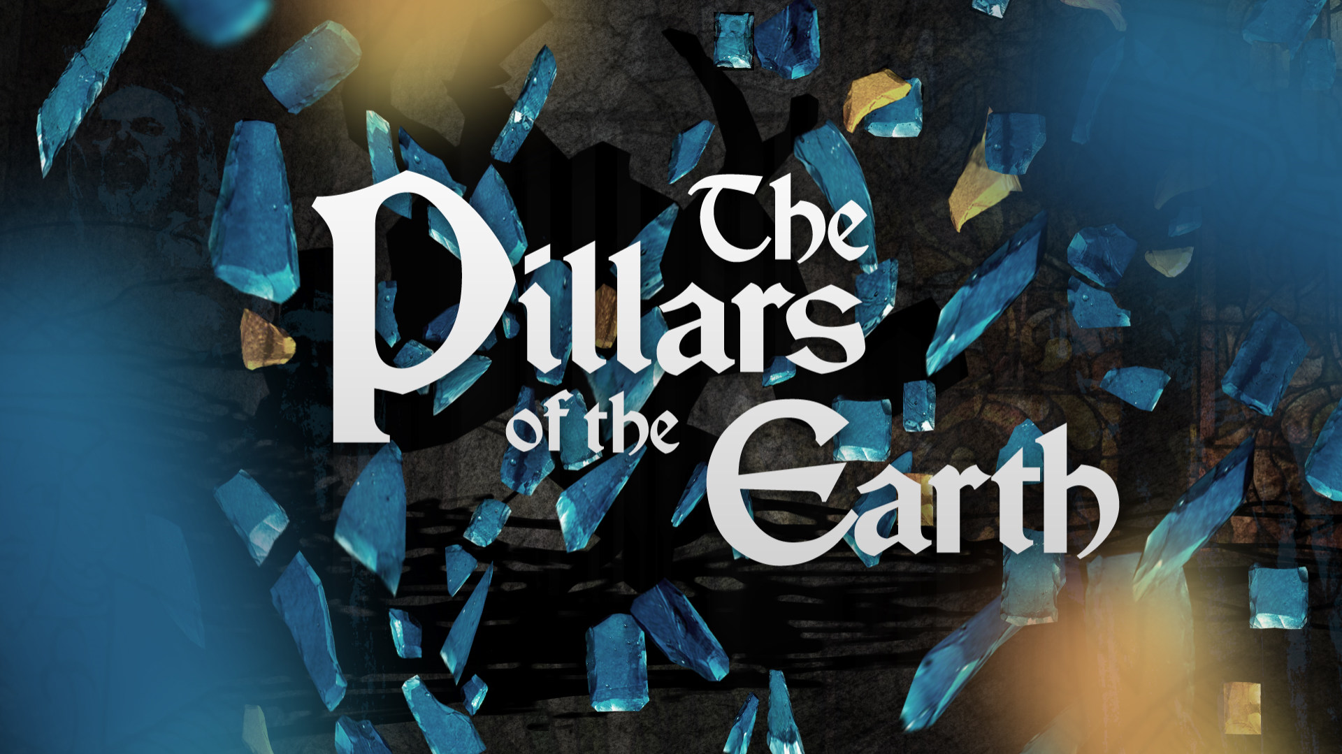
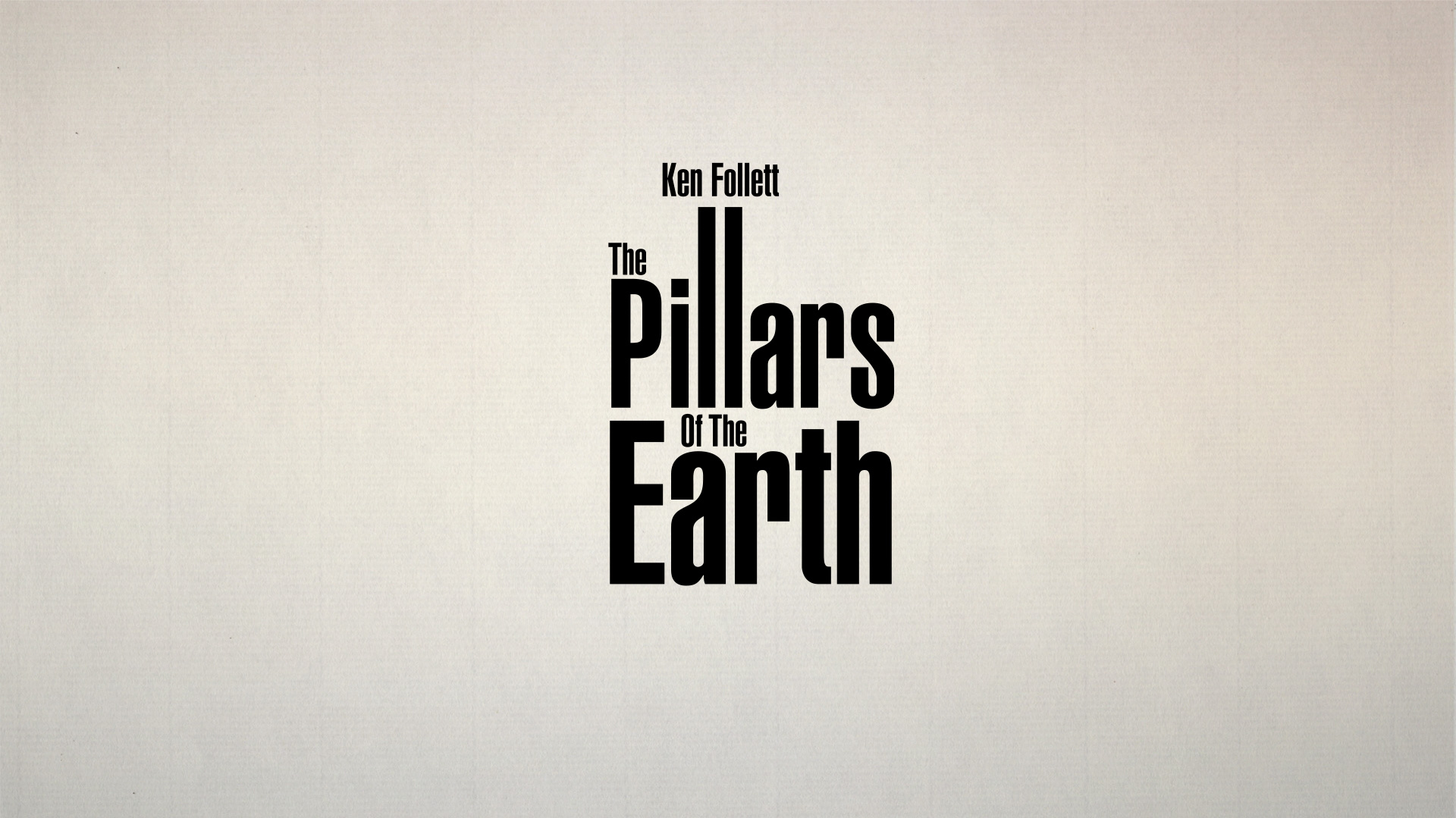
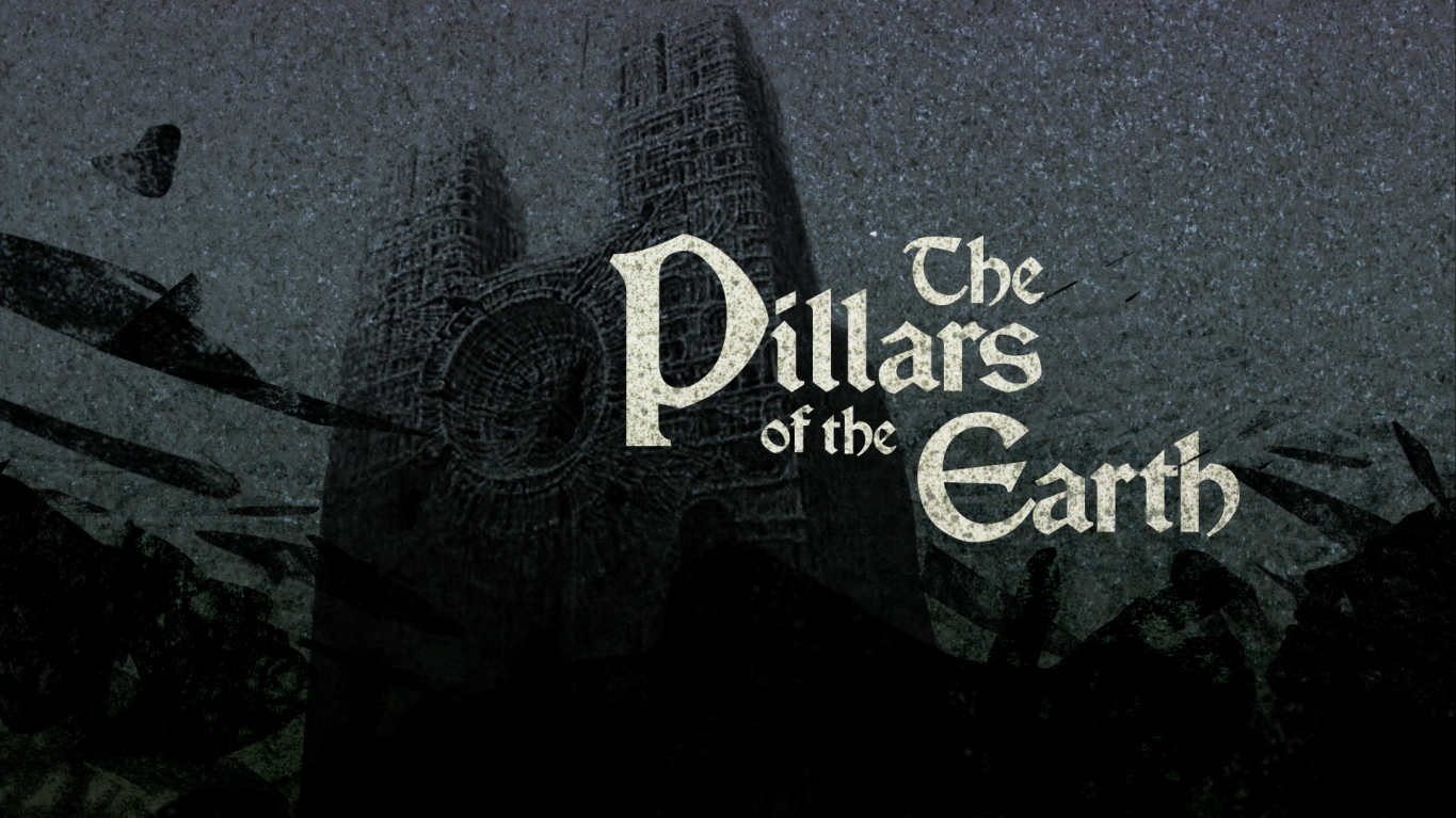
PILLARS OF THE EARTH
Case Study / Art of the Title interview fragments
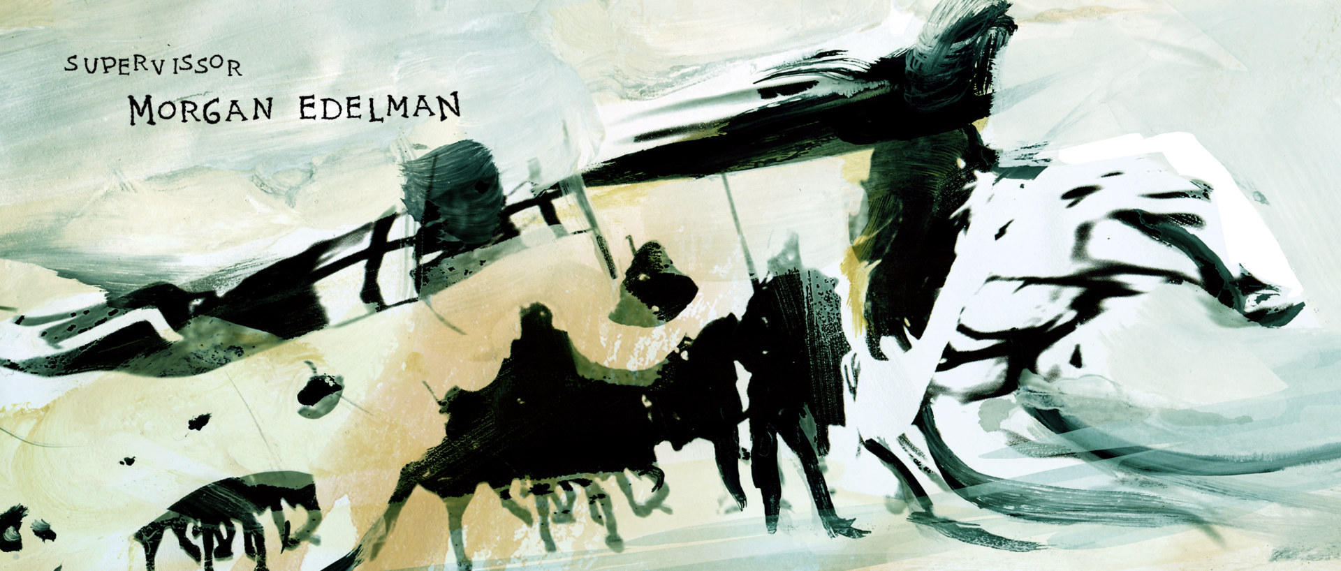
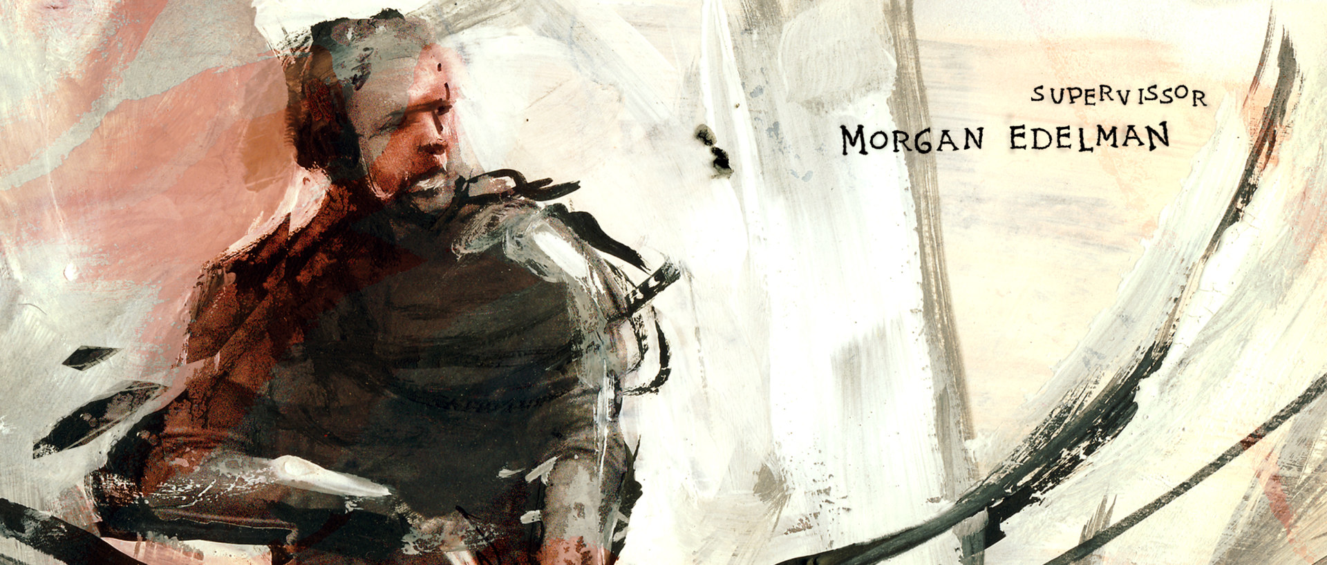
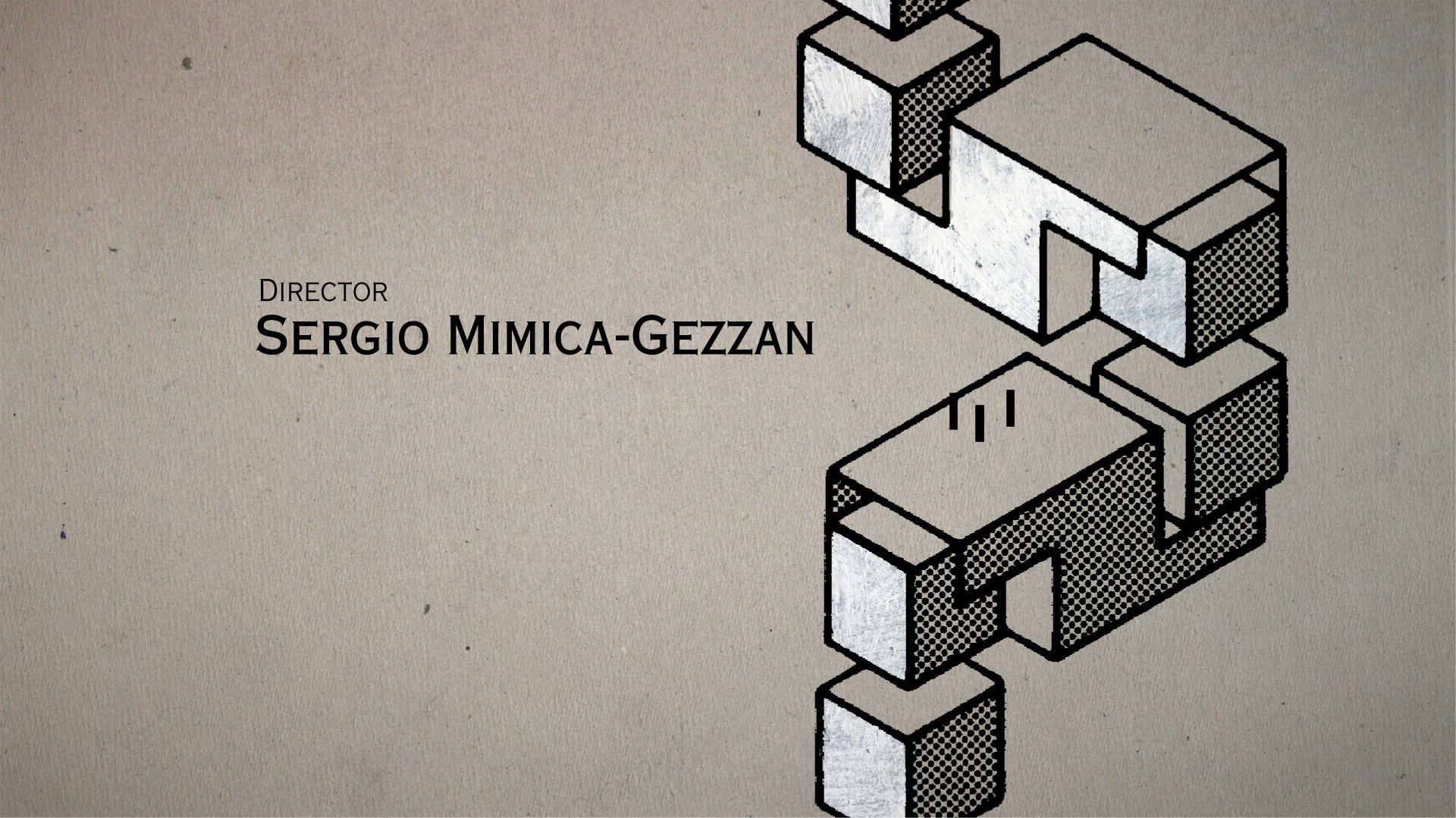
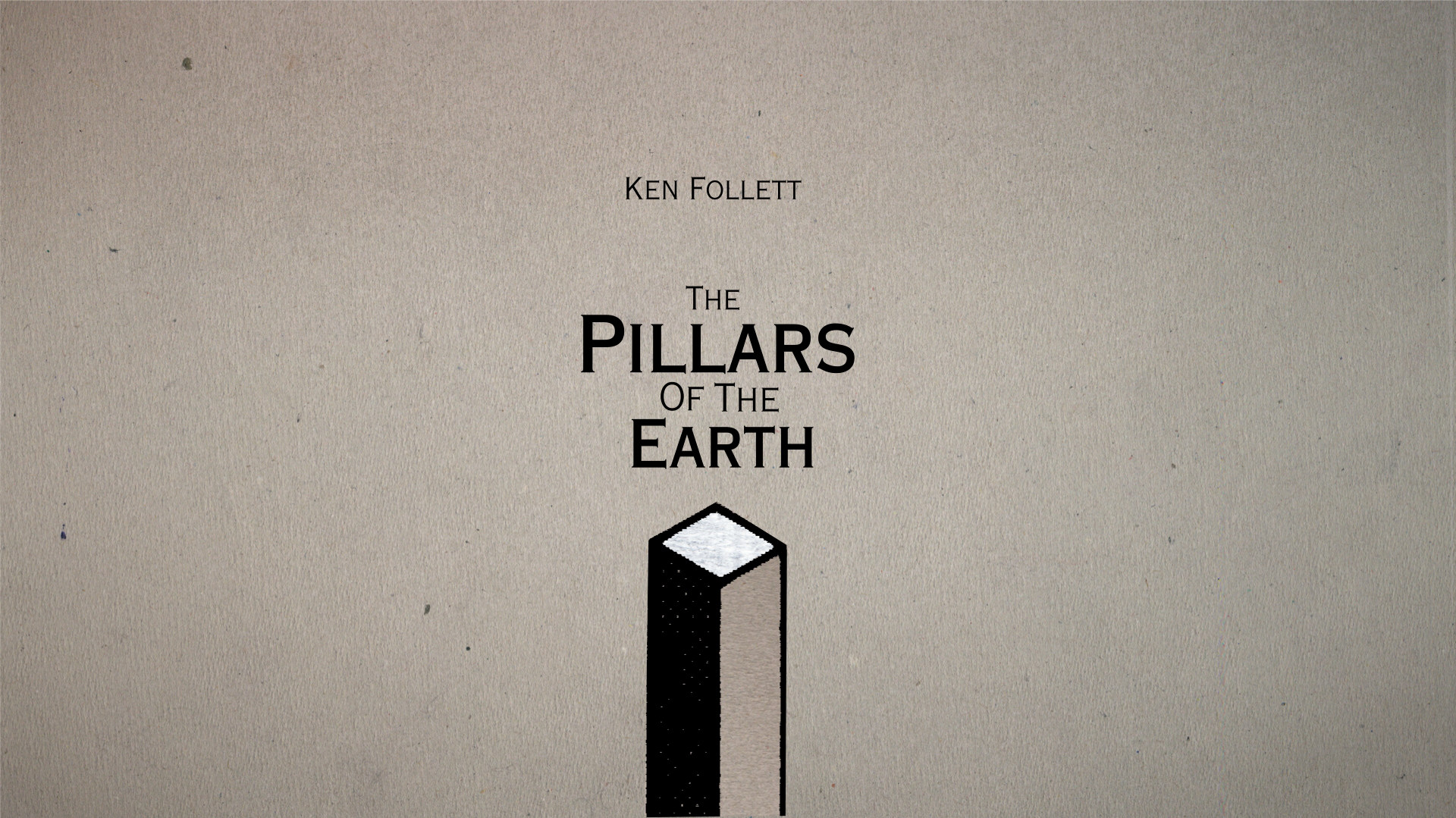
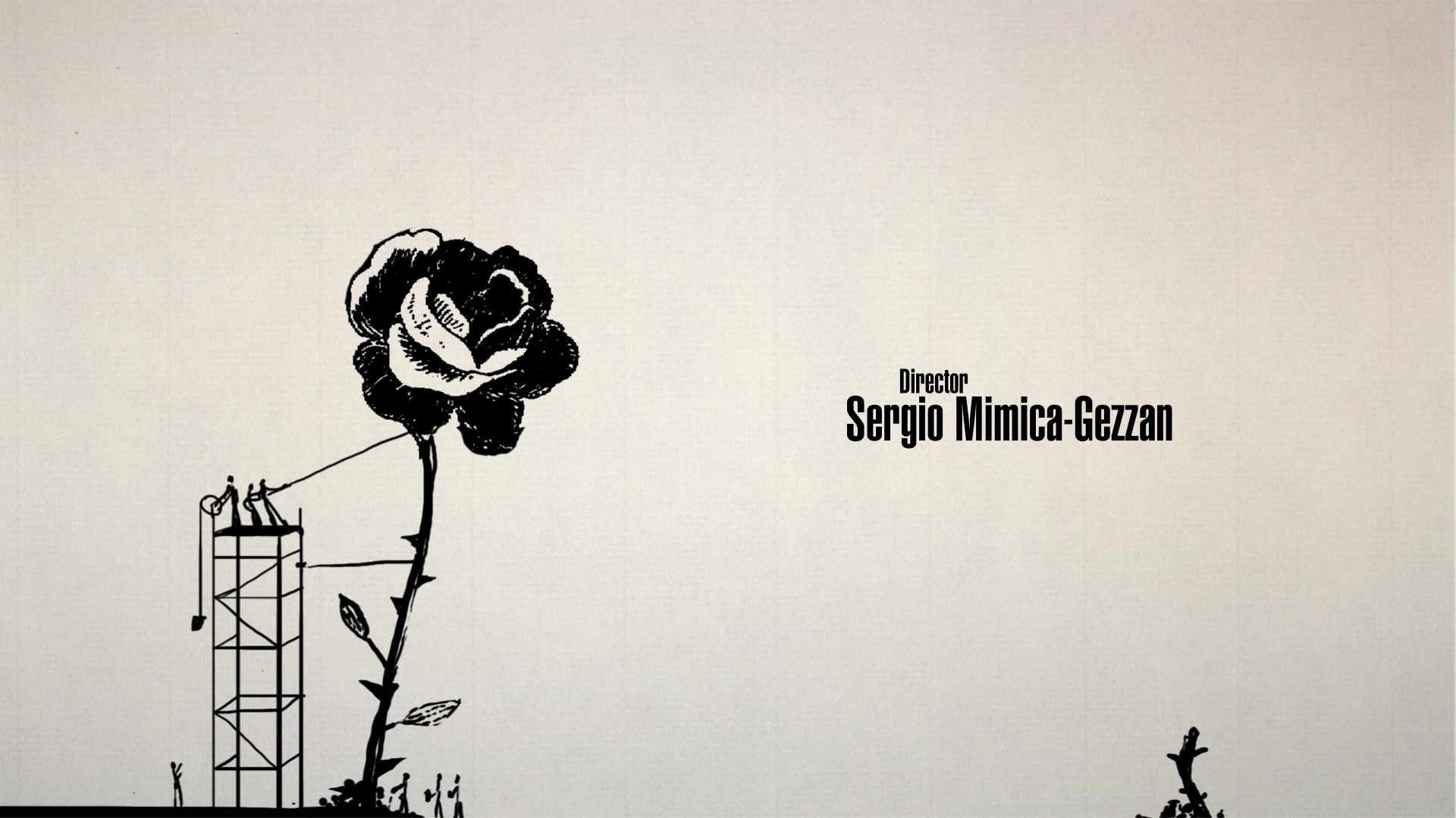
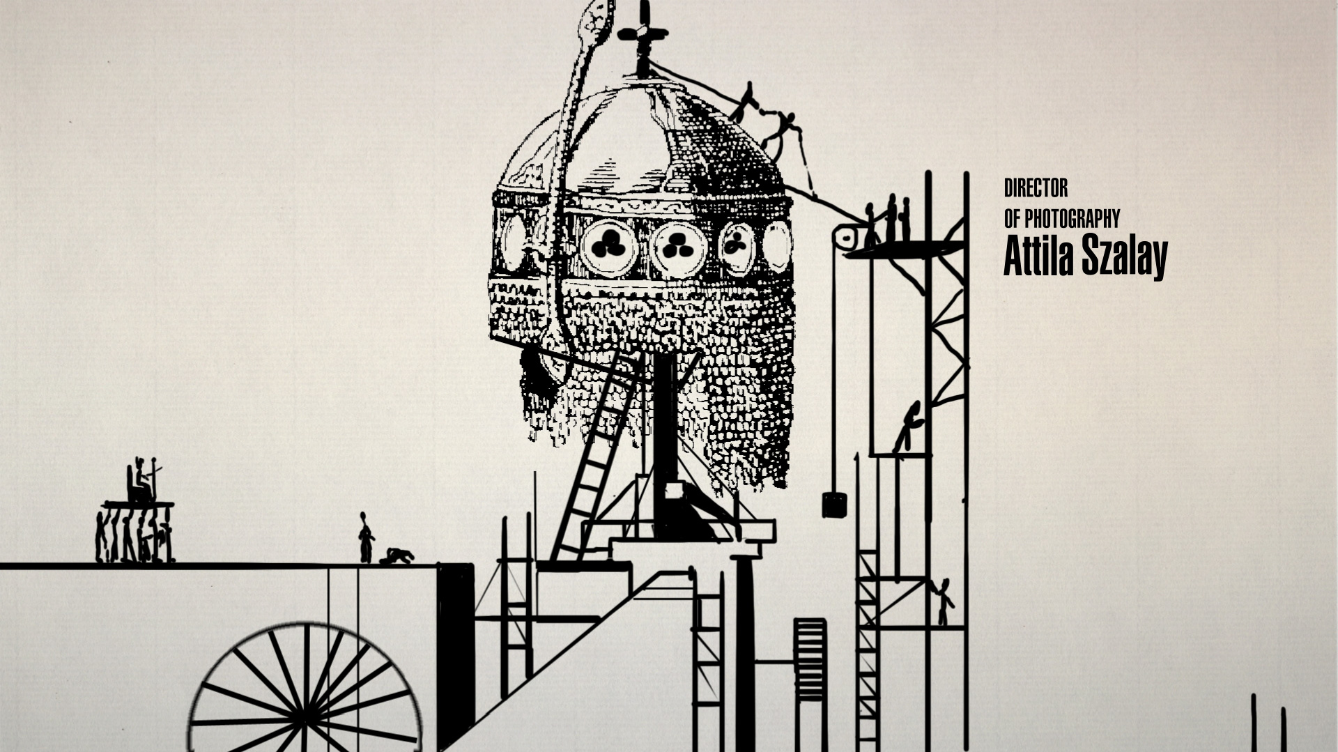
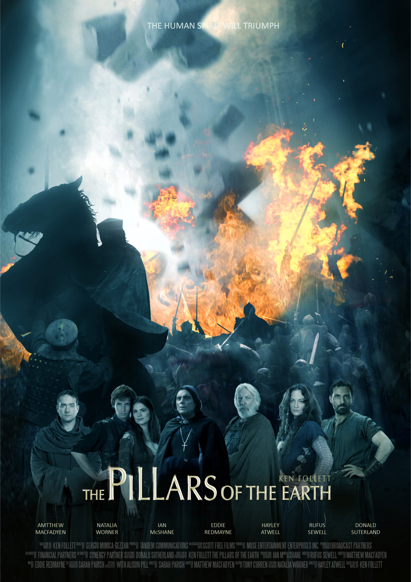
Twelfth century England. An era ruled by strife, anarchy — and the occasional king or queen — a period when “Christ and his saints were asleep.” This dark age provides the dramatic backdrop for The Pillars of the Earth, an epic miniseries based on author Ken Follet’s bestselling novel of the same name. The viewer’s introduction to this turbulent medieval world is Acme Filmworks’ title sequence, a restless, ever-shifting portrait of the war of succession following the death of Henry I’s heir. Accompanied by Trevor Morris’ bellowing orchestration, the sequence chronicles the efforts of one man to build England’s largest cathedral in brush strokes of fire, blood, steel, and stone.


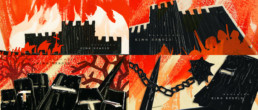
Robin Hood Concept, property of BrosFX studio / unauthorized reproduction, copying prohibited. All rights reserved
So, how did you come to work on The Pillars of the Earth?
It took a long time for the project to reach us. When I was visiting different animation festivals with Chick, I met Ron Diamond, a producer from ACME Filmworks, who suggested a long-term collaboration. After some small commercial productions we had the opportunity to design the opening credits for Robin Hood by Ridley Scott.

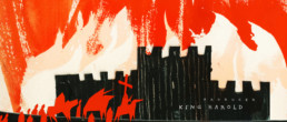
Robin Hood Concept, property of BrosFX studio / unauthorized reproduction, copying prohibited. All rights reserved
We pitched some concepts to Scott Free along with several other studios but we didn’t manage to win that project. They liked our pitch, though, so they let us pitch for the opening title sequence of a miniseries, The Pillars of the Earth, based on Ken Follet’s novel.
What were your initial concepts? What were you inspired by?
We obtained a short script of the series. Time was short so we worked hard and created many interesting concepts. Each of us interpreted the idea from a different angle and we created seven concepts altogether.


Robin Hood Concept, property of BrosFX studio / unauthorized reproduction, copying prohibited. All rights reserved
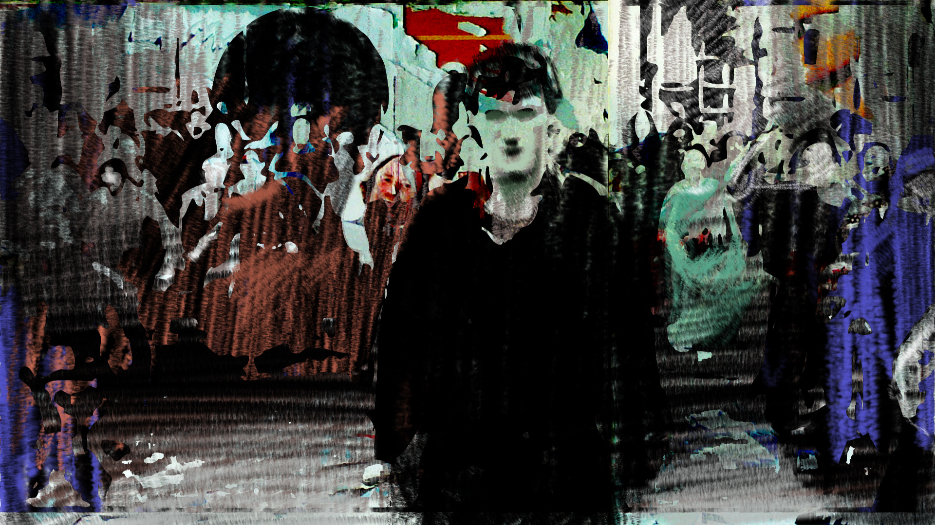
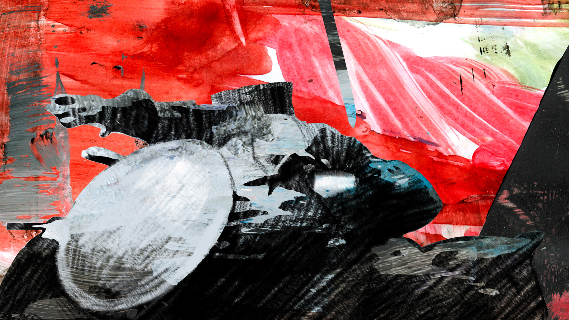
They were inspired by different directions: Polish posters, graffiti, minimalism, drawings, stained glass, the American version of The Ring, Anglo-Saxon and Norman symbols. We tried not to be inspired by already existing title sequences; we wanted to create something completely new and different. From a marketing point of view, it is not a good idea to offer so many versions, but in this case the variety paid off.
They liked two of our concepts so they gave us a month to do some animation tests. They were curious about how it would look in animation… and so were we.
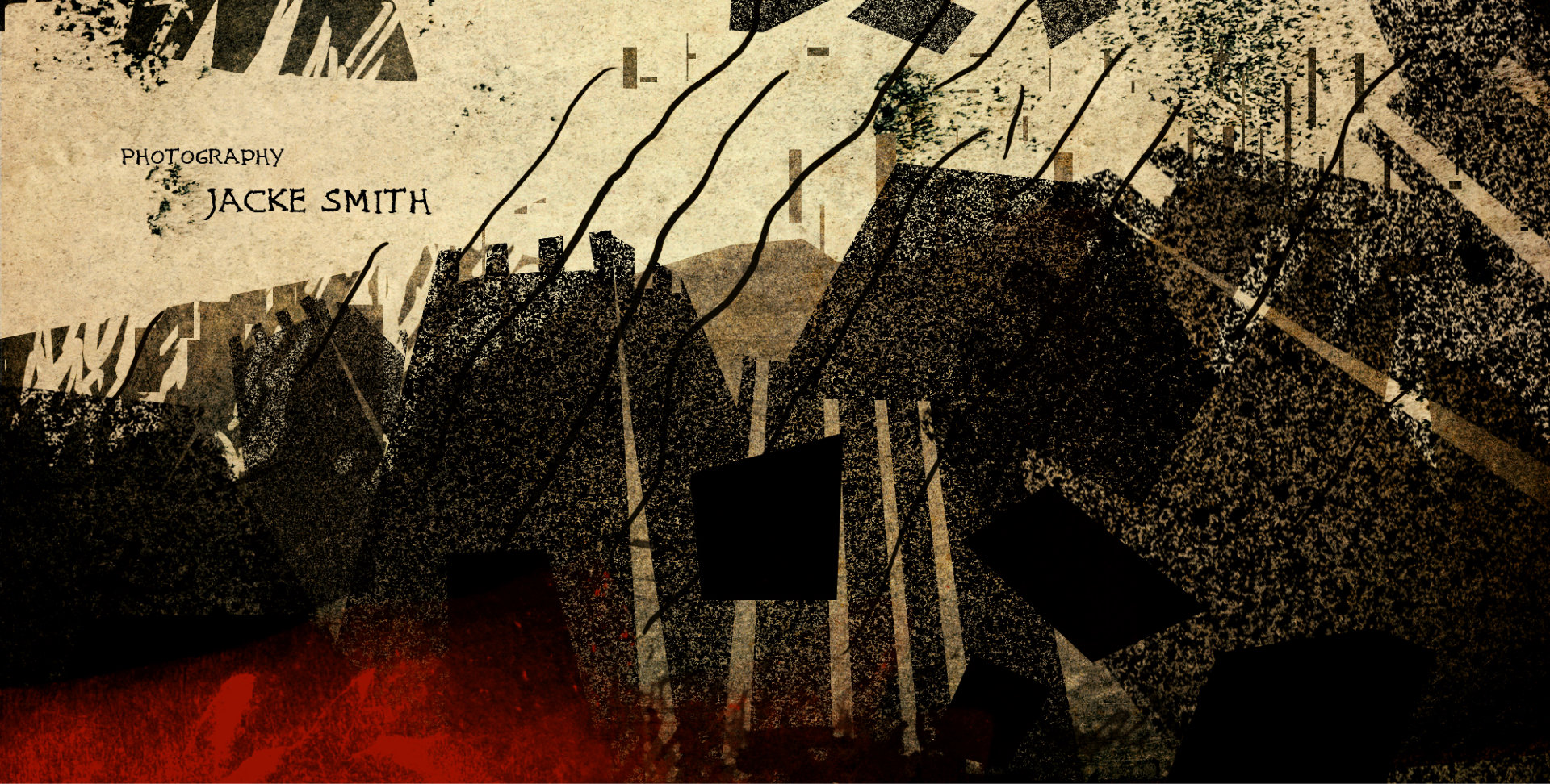
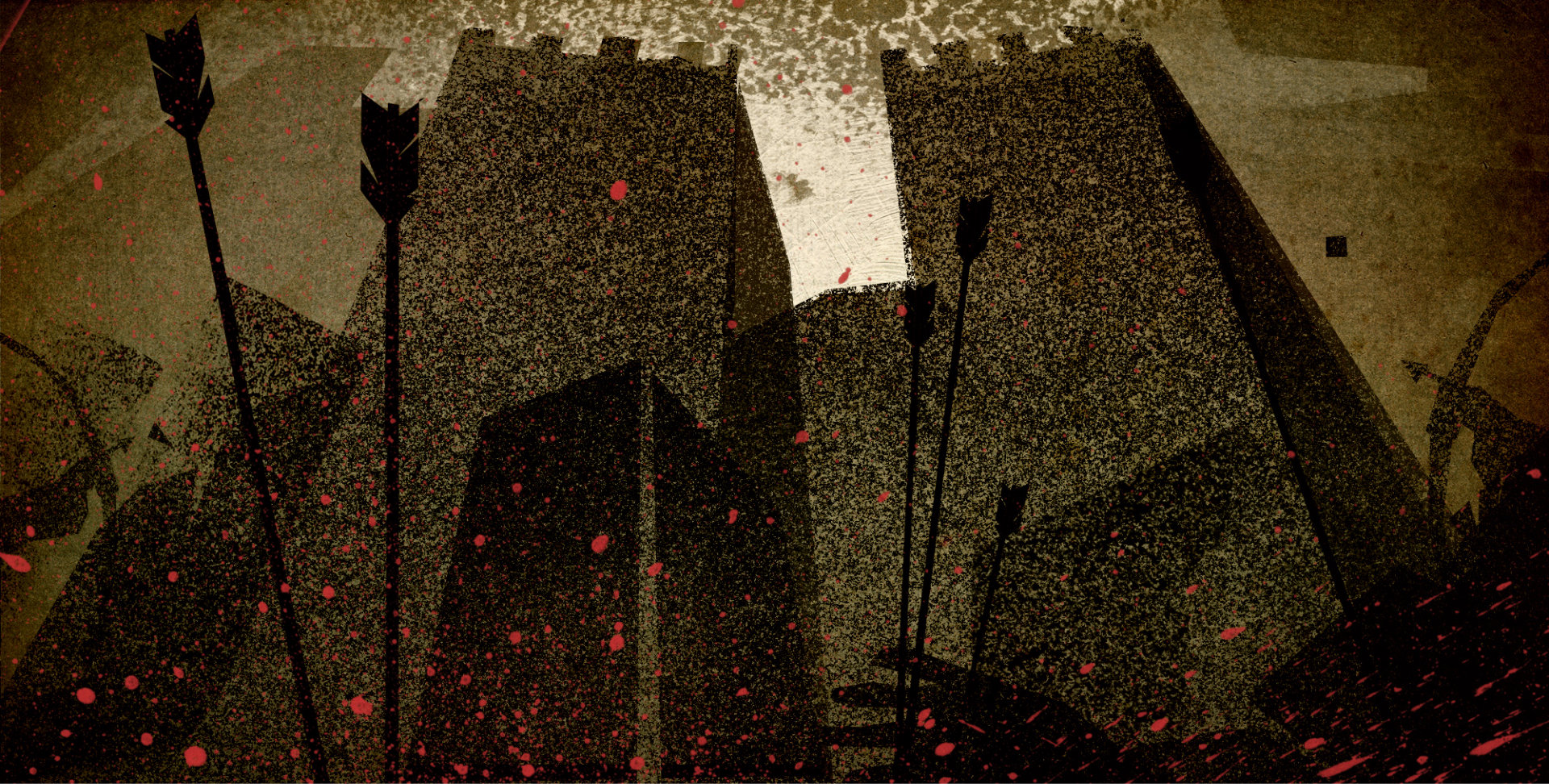
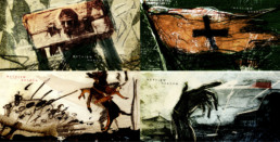
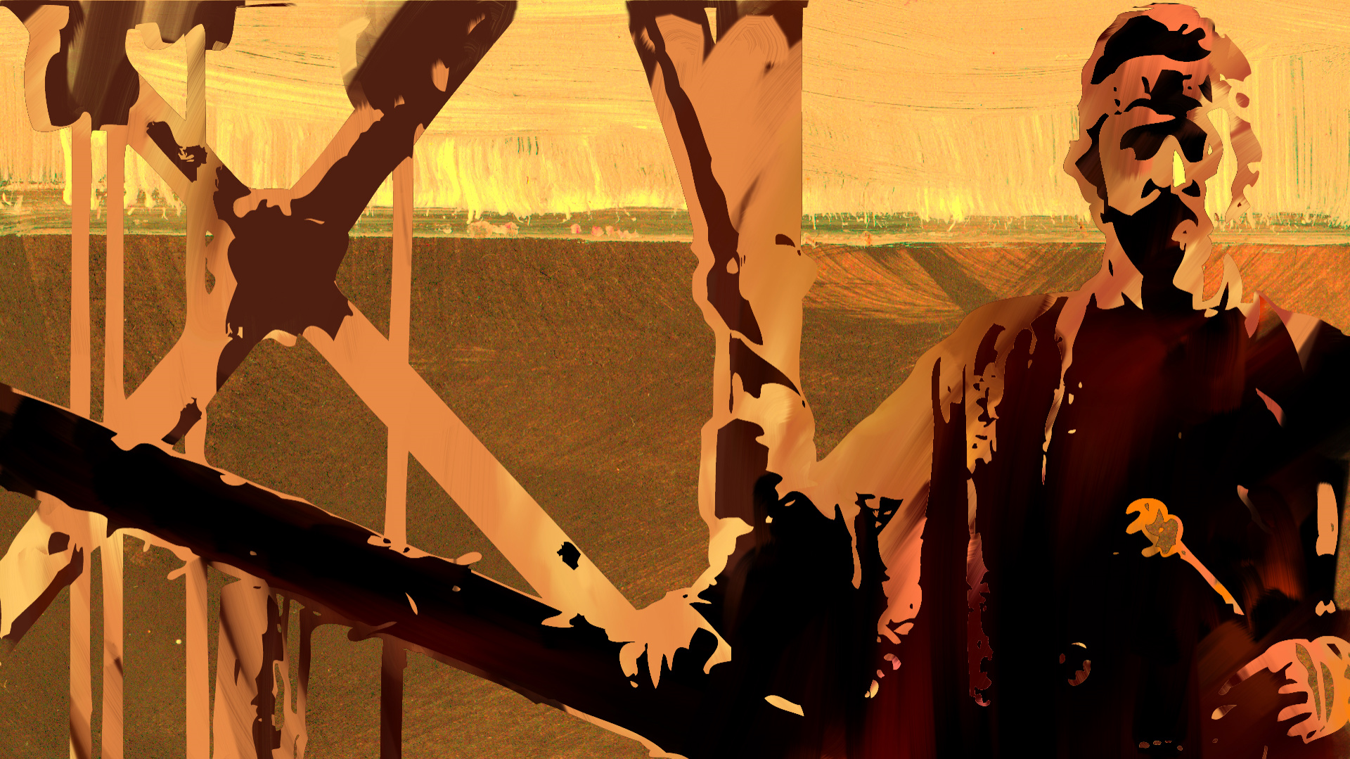
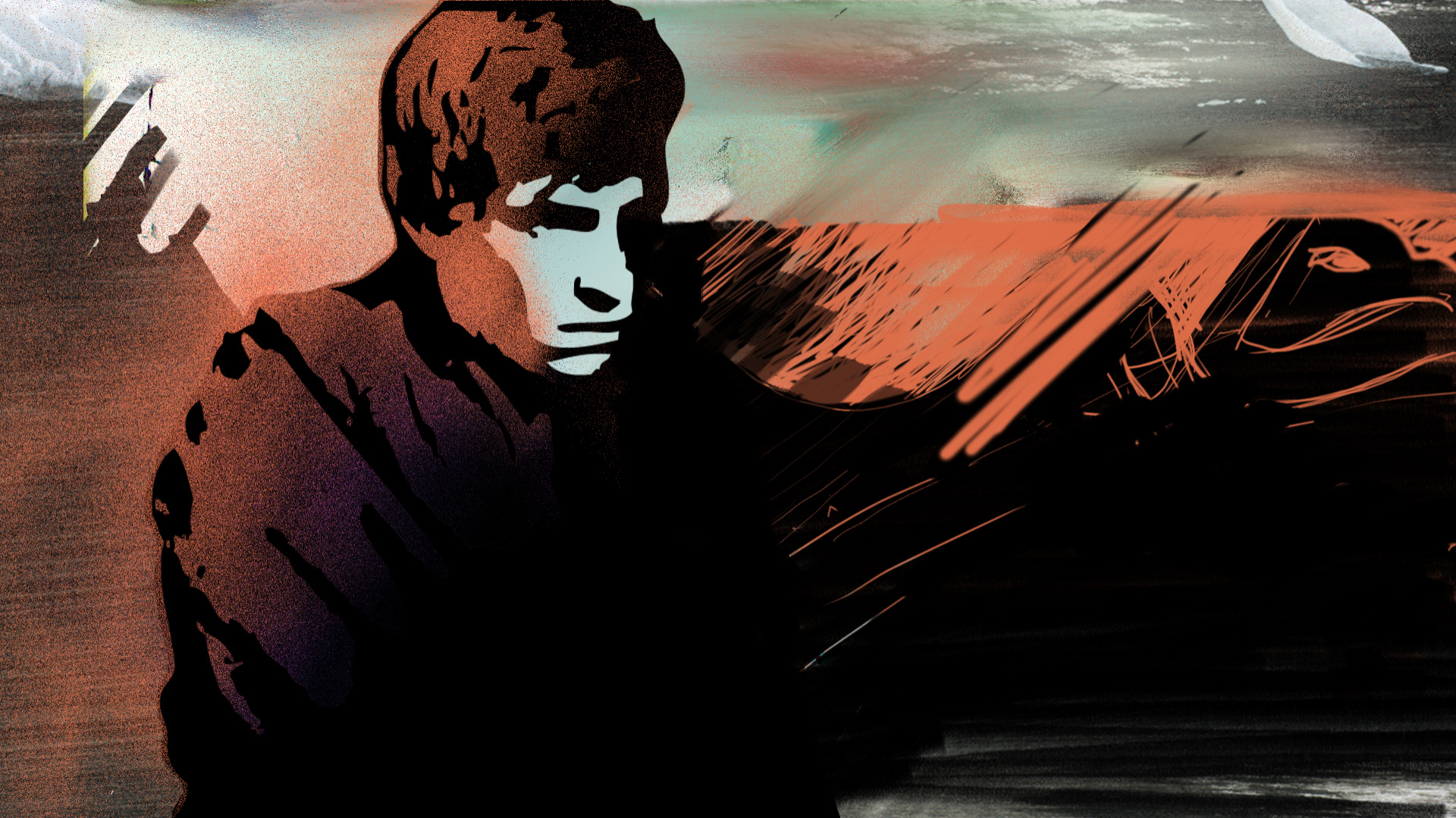
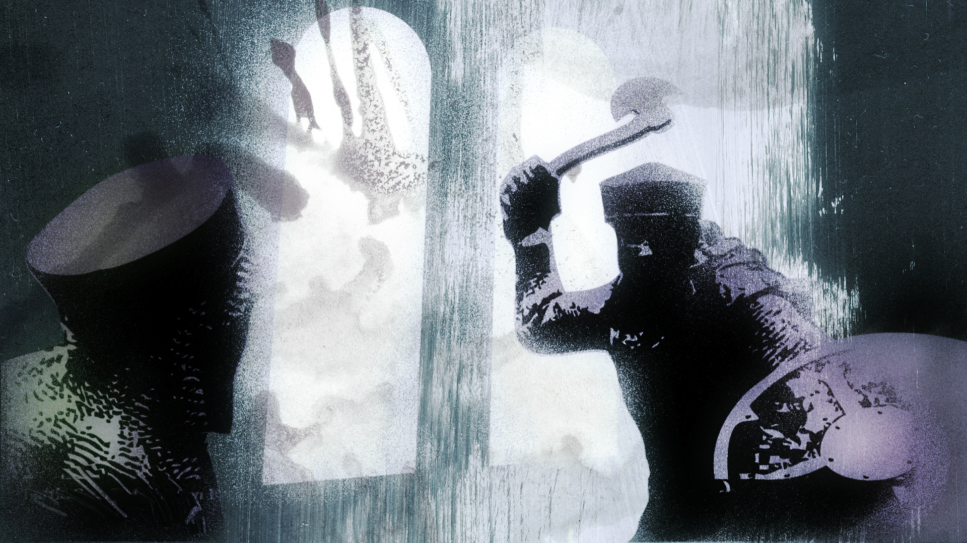
Concept 1


Pillars of the Earth Concept, property of BrosFX studio / unauthorized reproduction, copying prohibited. All rights reserved
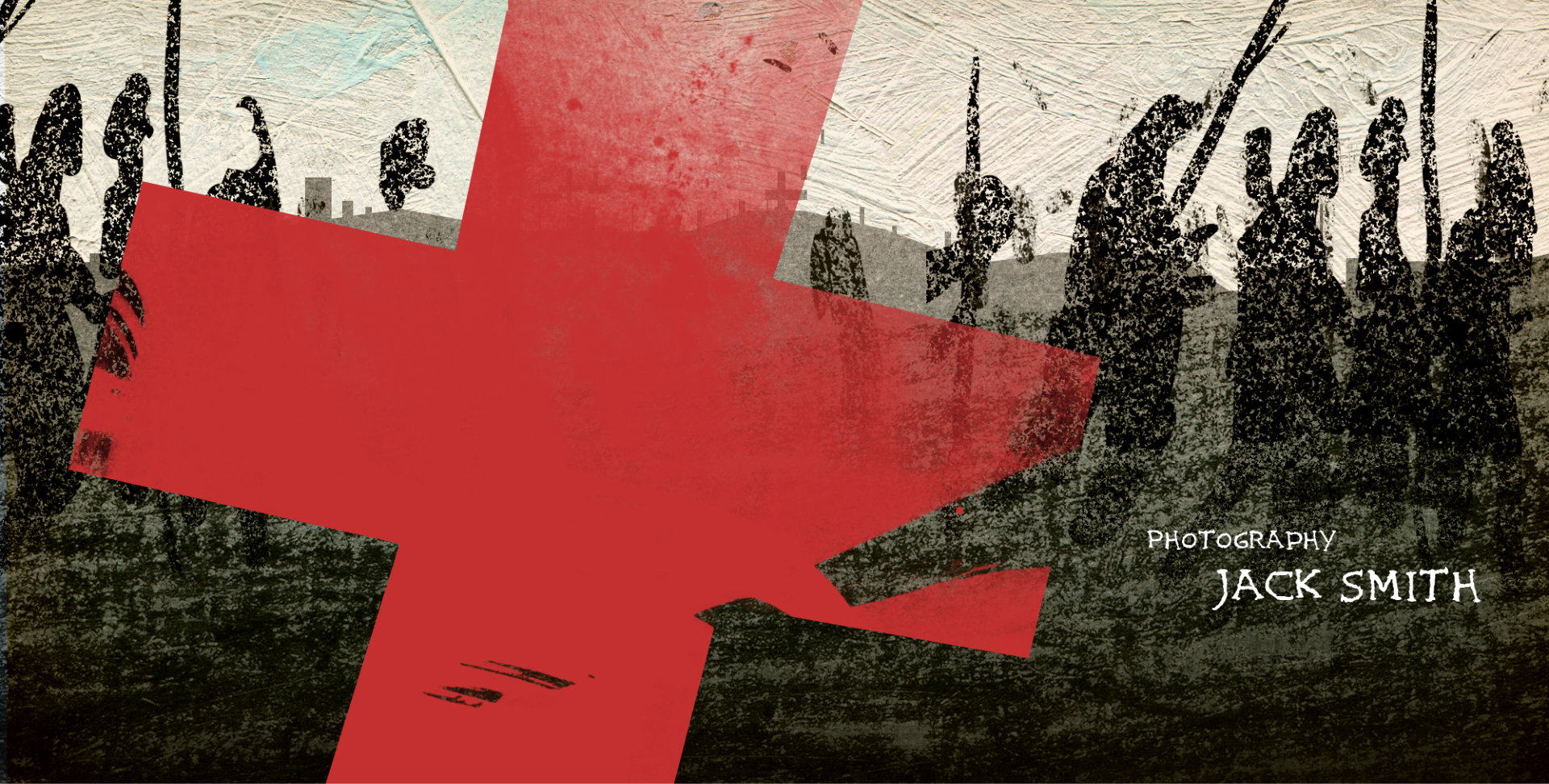
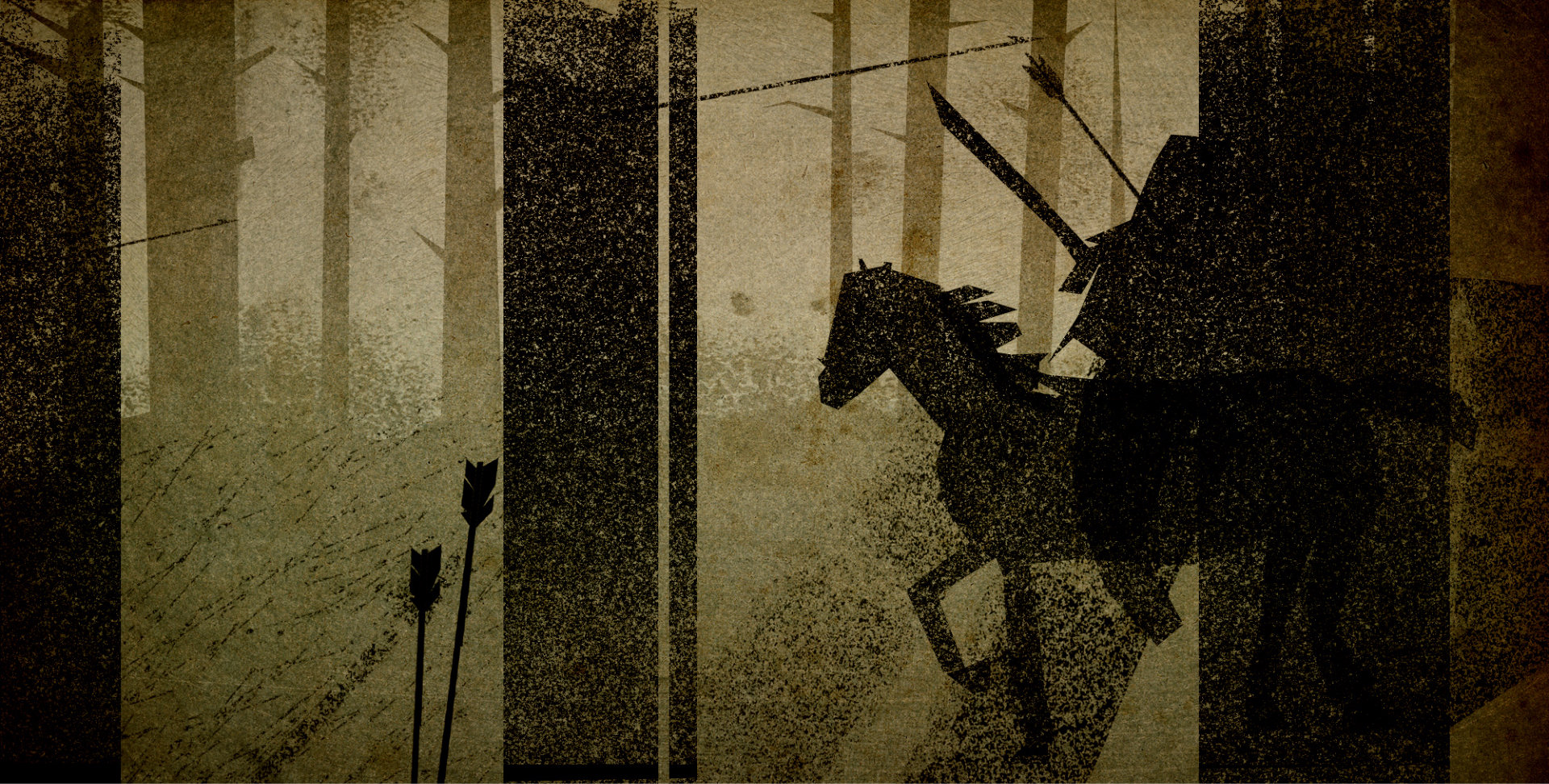
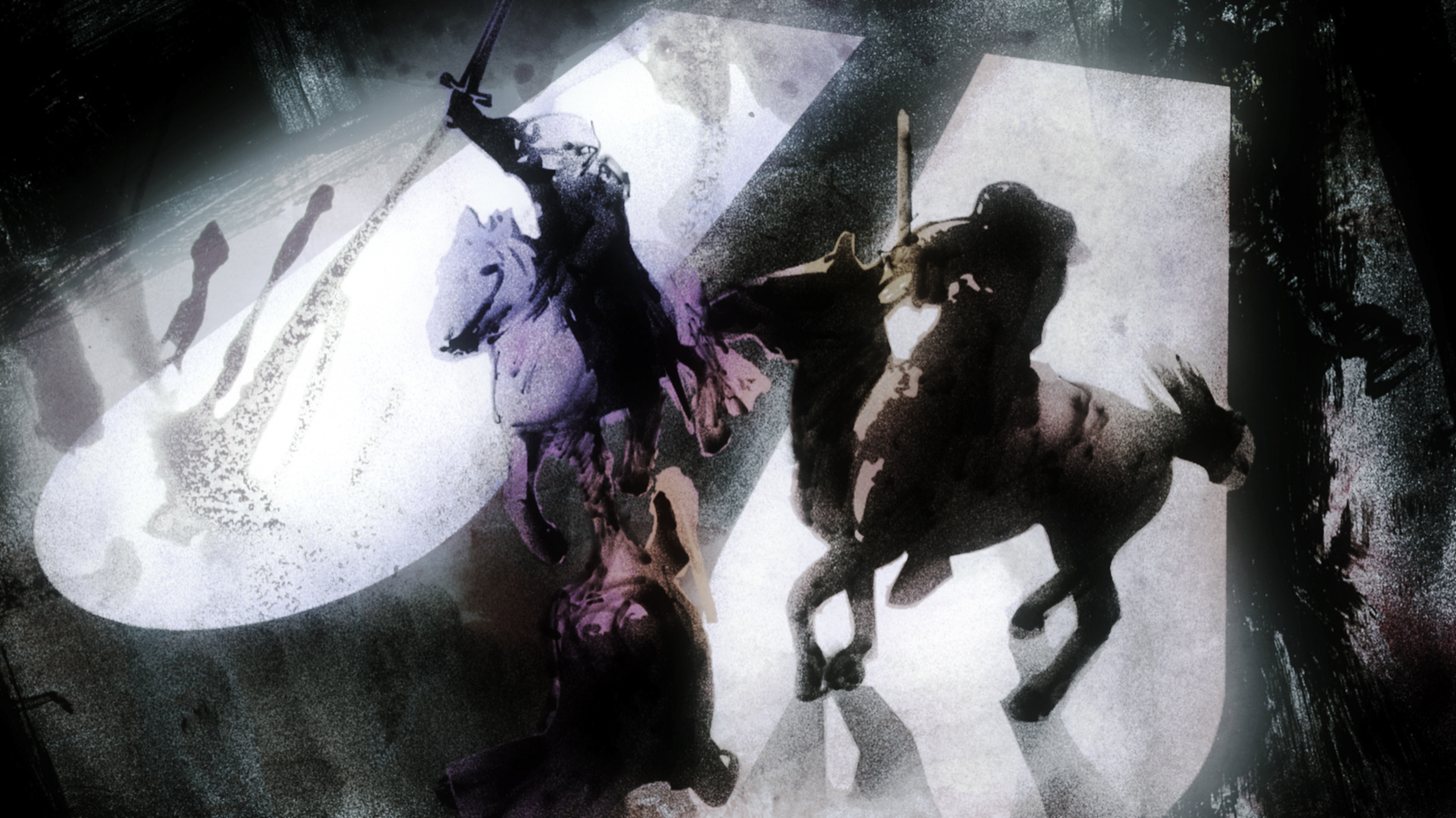
Concept 2
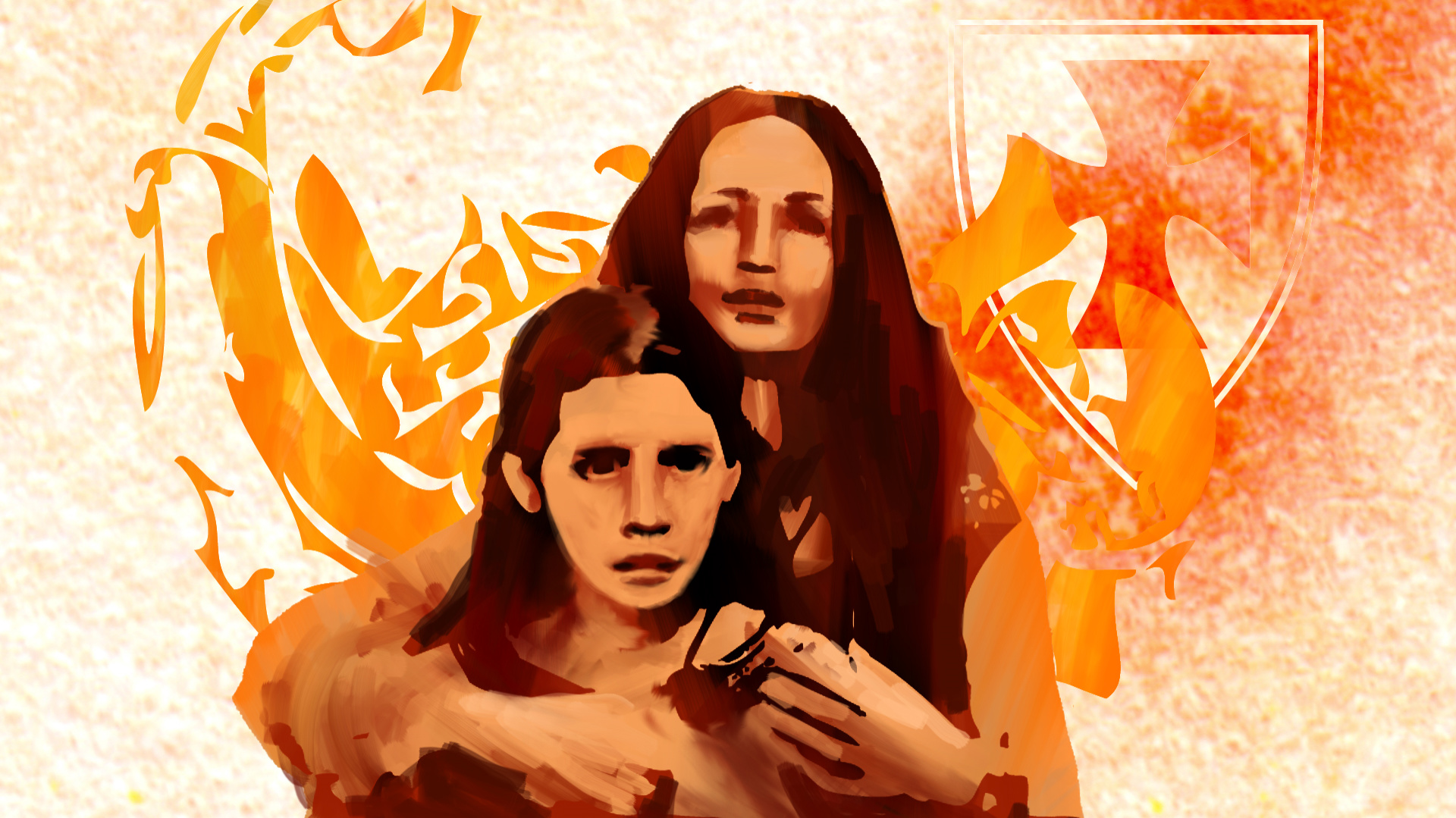
Pillars of the Earth Concept, property of BrosFX studio / unauthorized reproduction, copying prohibited. All rights reserved
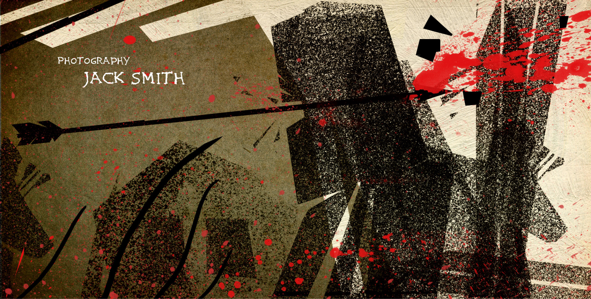
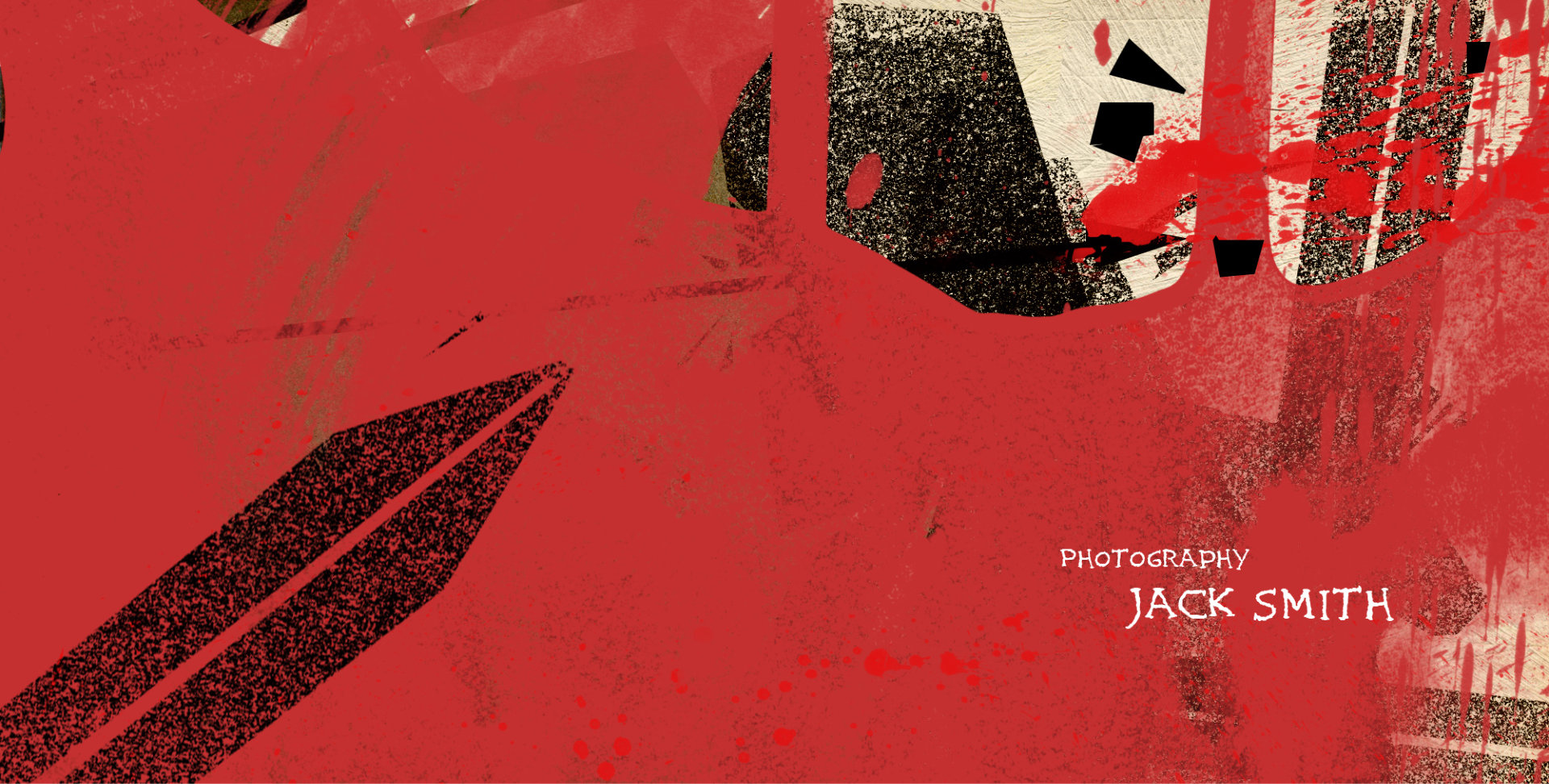
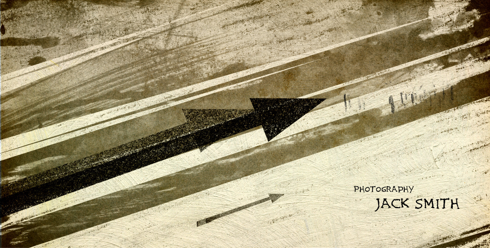
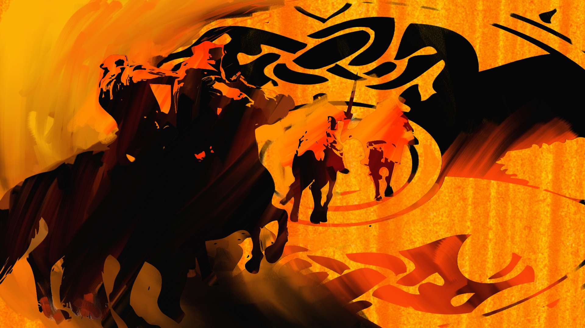
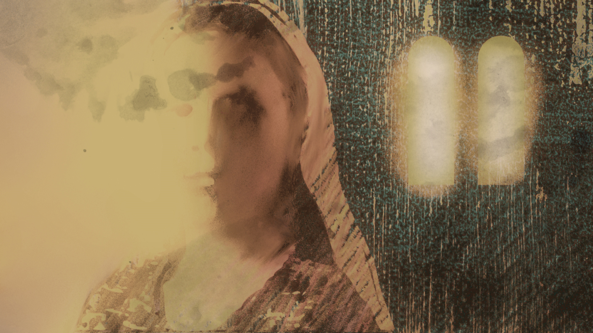
Concept 3
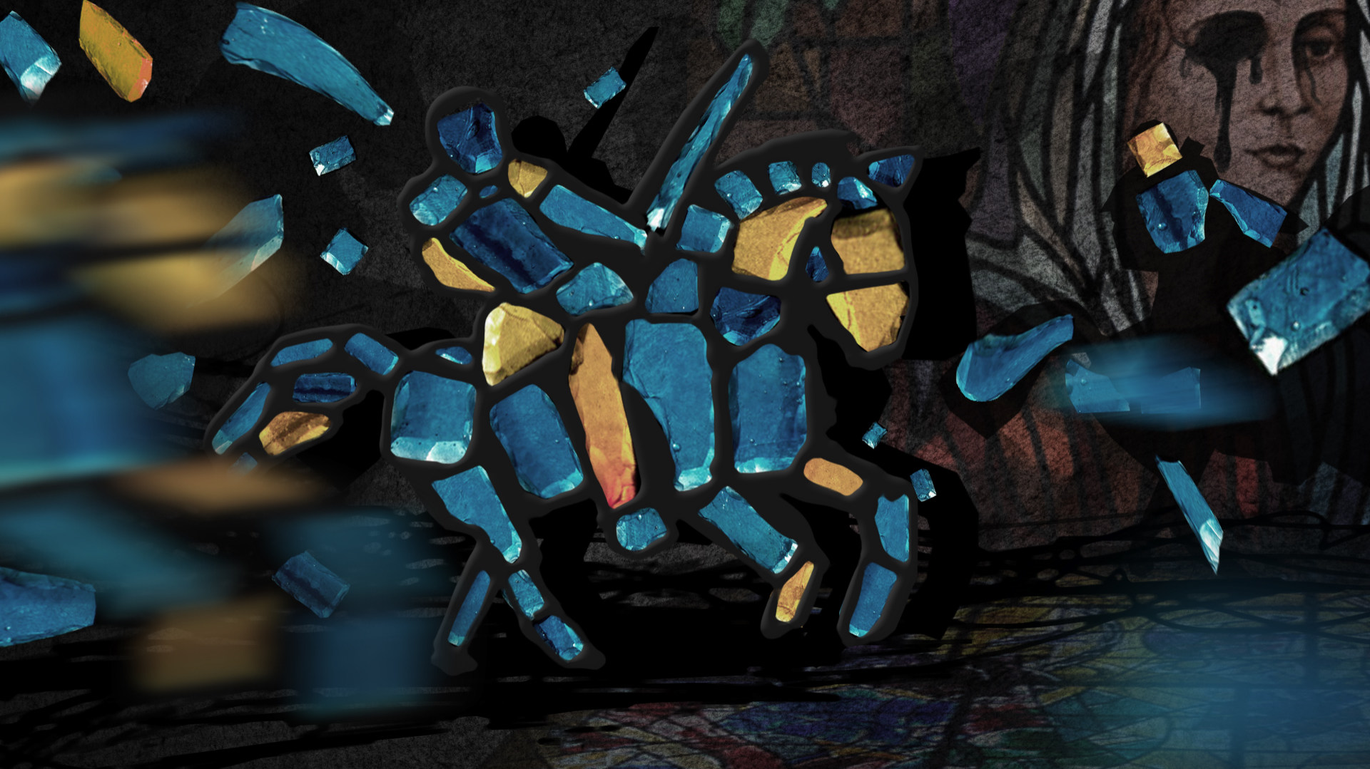

Pillars of the Earth Concept, property of BrosFX studio / unauthorized reproduction, copying prohibited. All rights reserved
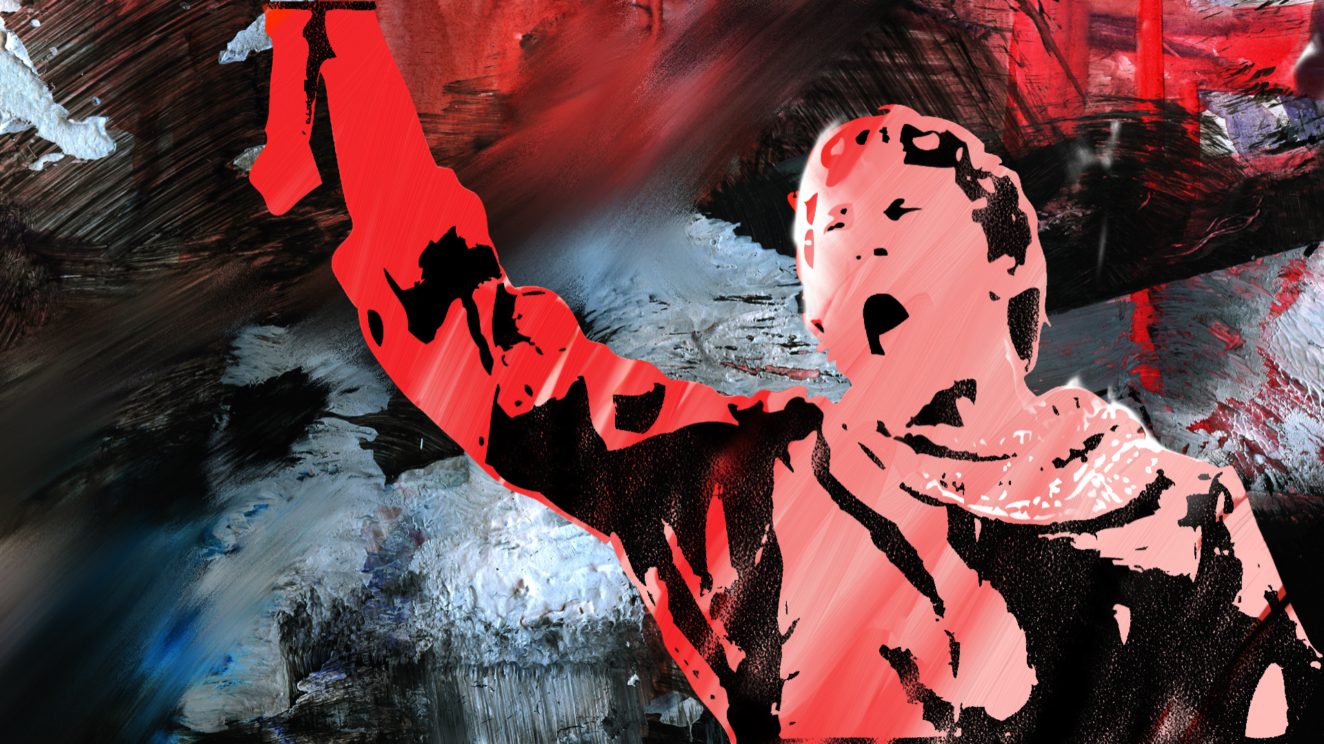
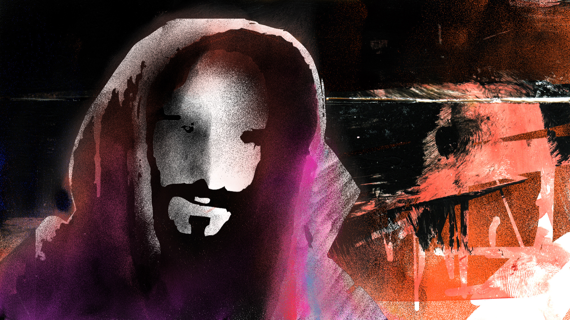
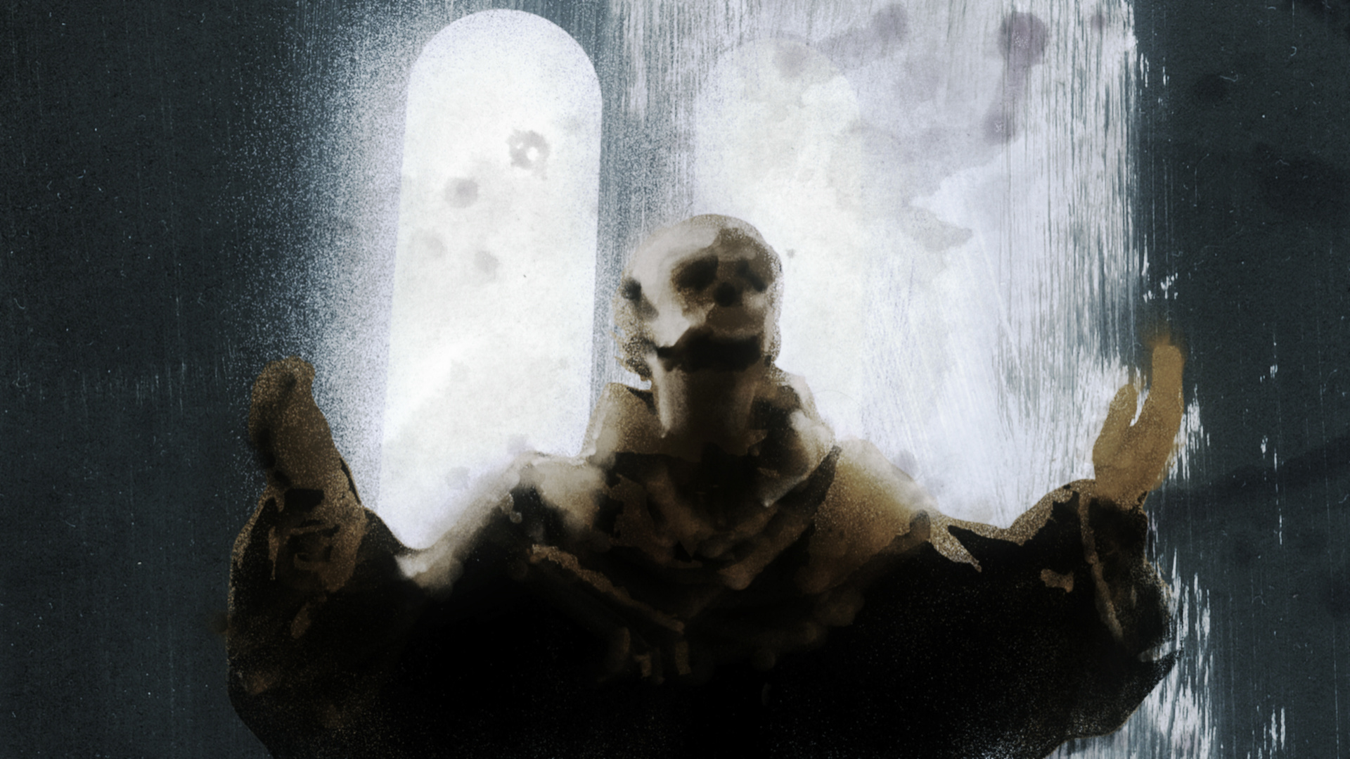
This concept was quite dark. My goal was to show surrealistic images suspended somewhere in space, all created in 3D.
How did you decide on the sketchy, painted style?
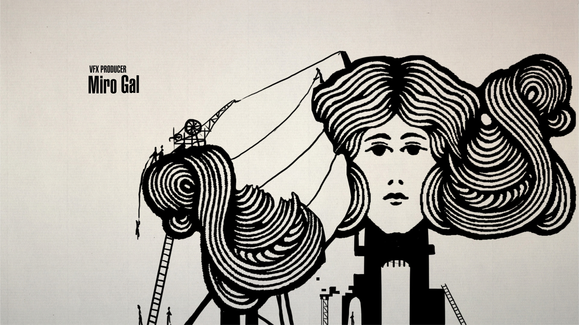
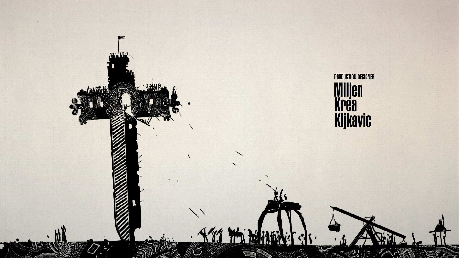
We felt the client wanted a title sequence created by artists, not by a big studio. So we applied a fast, sketchy, painted style — we wanted to grasp that essence from some of our references.
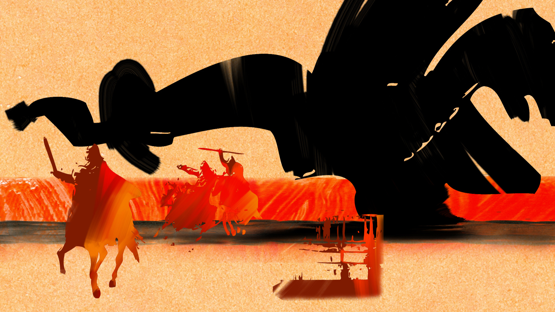
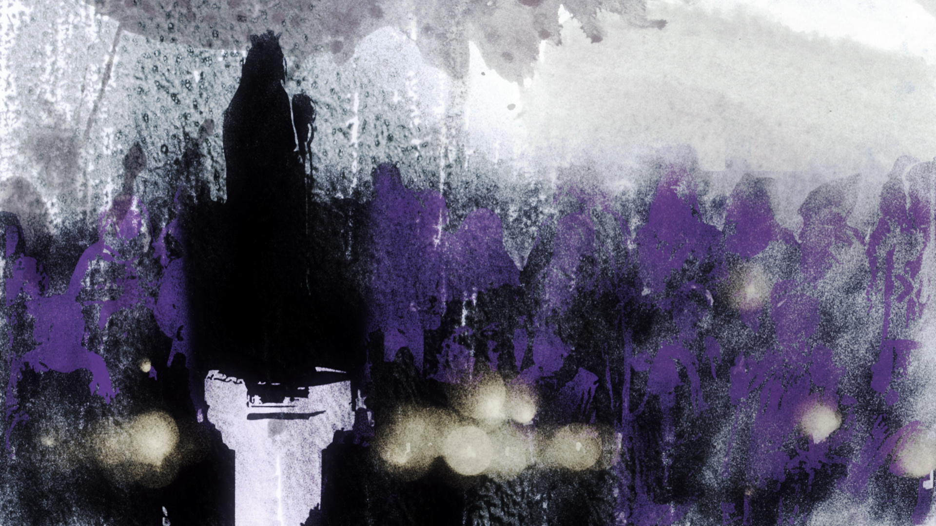
Concept 4


Pillars of the Earth Concept, property of BrosFX studio / unauthorized reproduction, copying prohibited. All rights reserved
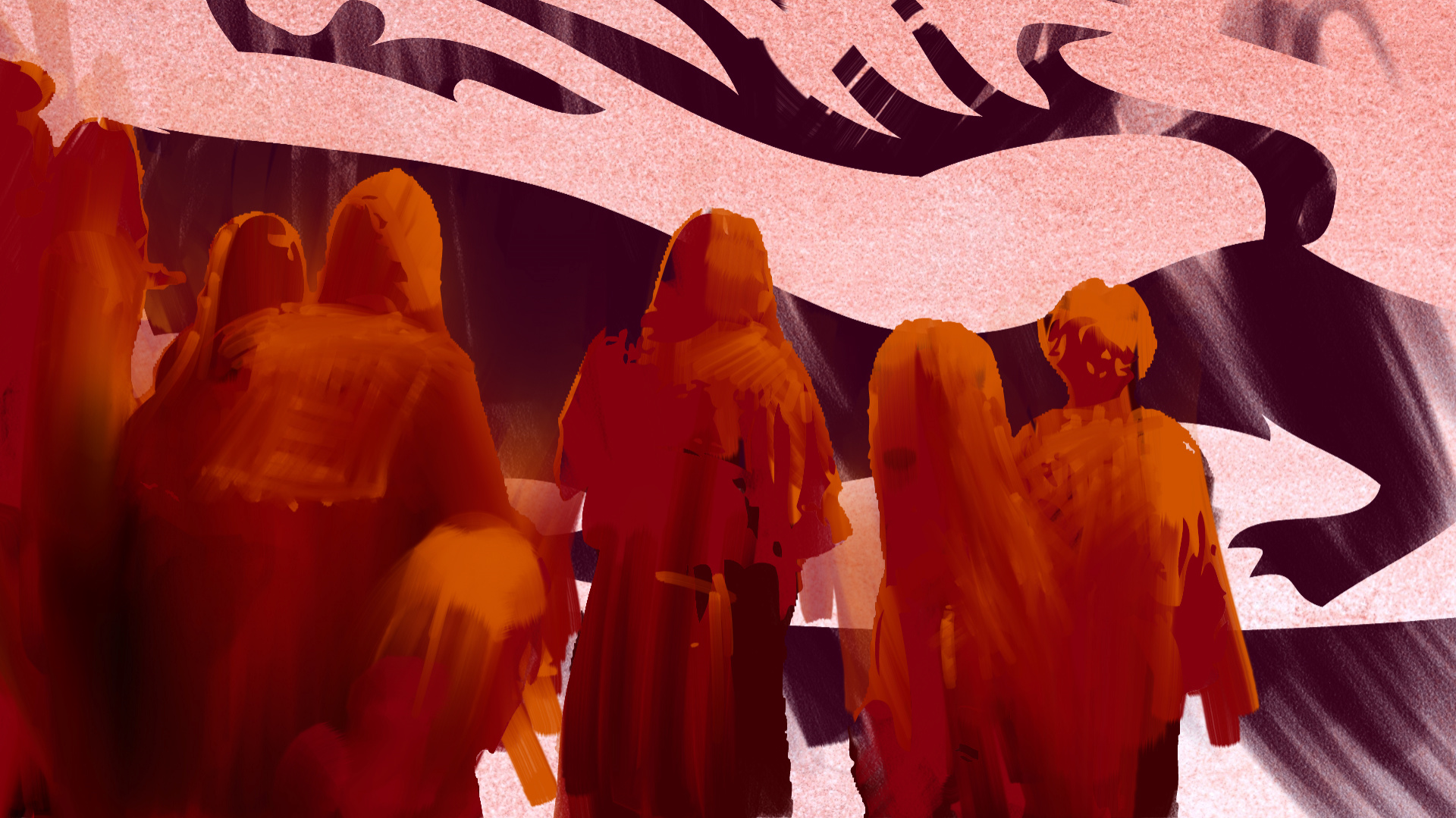
Concept 5
Pillars of the Earth Concept, property of BrosFX studio / unauthorized reproduction, copying prohibited. All rights reserved
We decided to develop the first concept, saying no to flat templates. We added more traces of brush, pencil, and spray. Our animation test was approved and we became the official creators of the sequence for the show.
Did you storyboard?
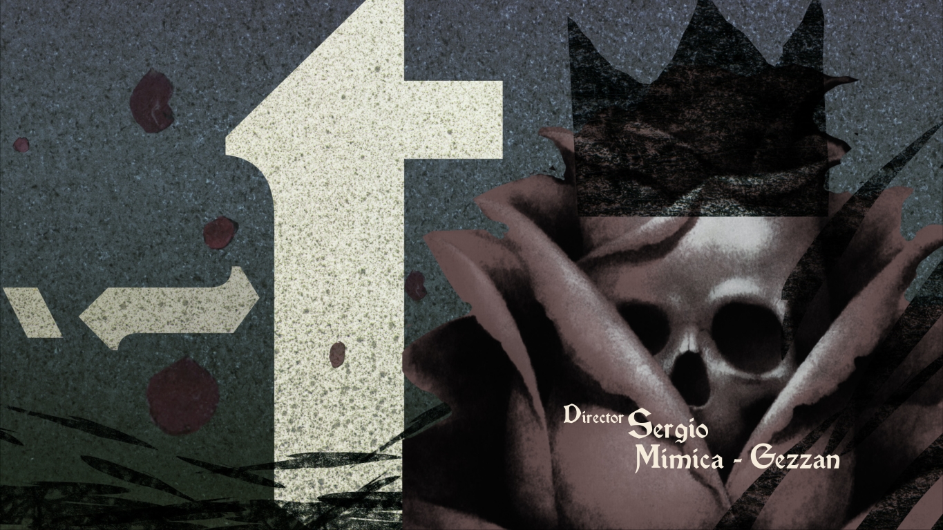
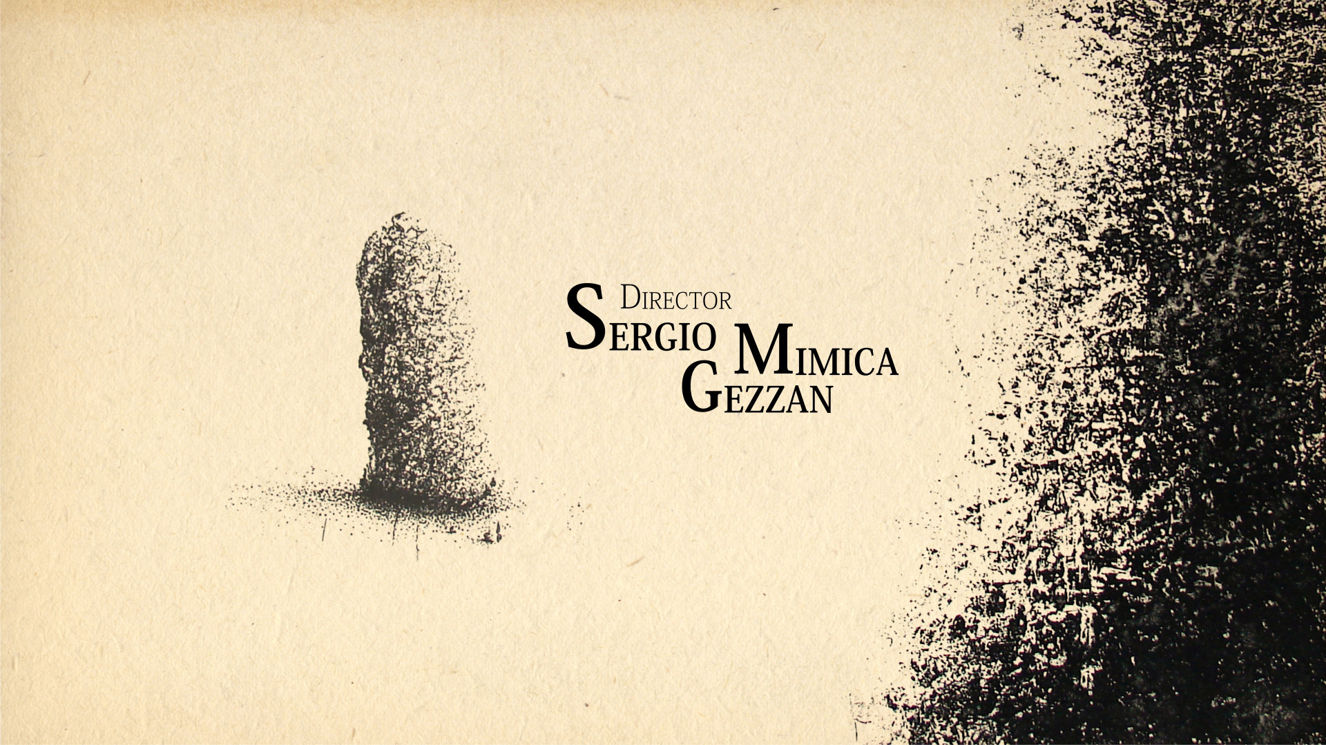
In the primary concept we wanted to use video material from the show as reference points to paint the scenes in the sequence. We edited the video materials that we obtained and made the first animatic. It turned out that the 50-second animation was too static. What’s more, the scenes taken from the film were giving away too much of the plot. After a discussion with the director, Sergio Mimica-Gezzan, we decided to make it more dynamic. He gave us a few tips and we created some simple animatics which were constantly changing.
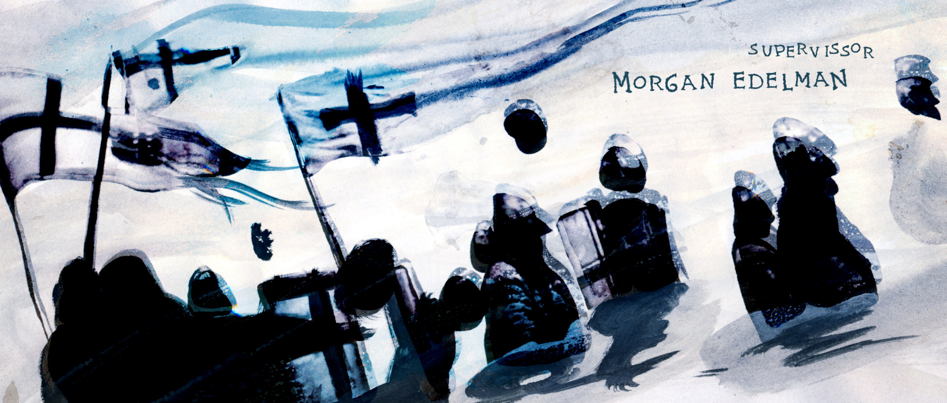
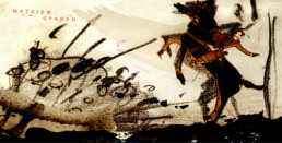
Concept 6


Pillars of the Earth Concept, property of BrosFX studio / unauthorized reproduction, copying prohibited. All rights reserved
Concept 7

Pillars of the Earth Concept, property of BrosFX studio / unauthorized reproduction, copying prohibited. All rights reserved
Were there any sketches or elements that didn’t make it to the final cut that you particularly liked?
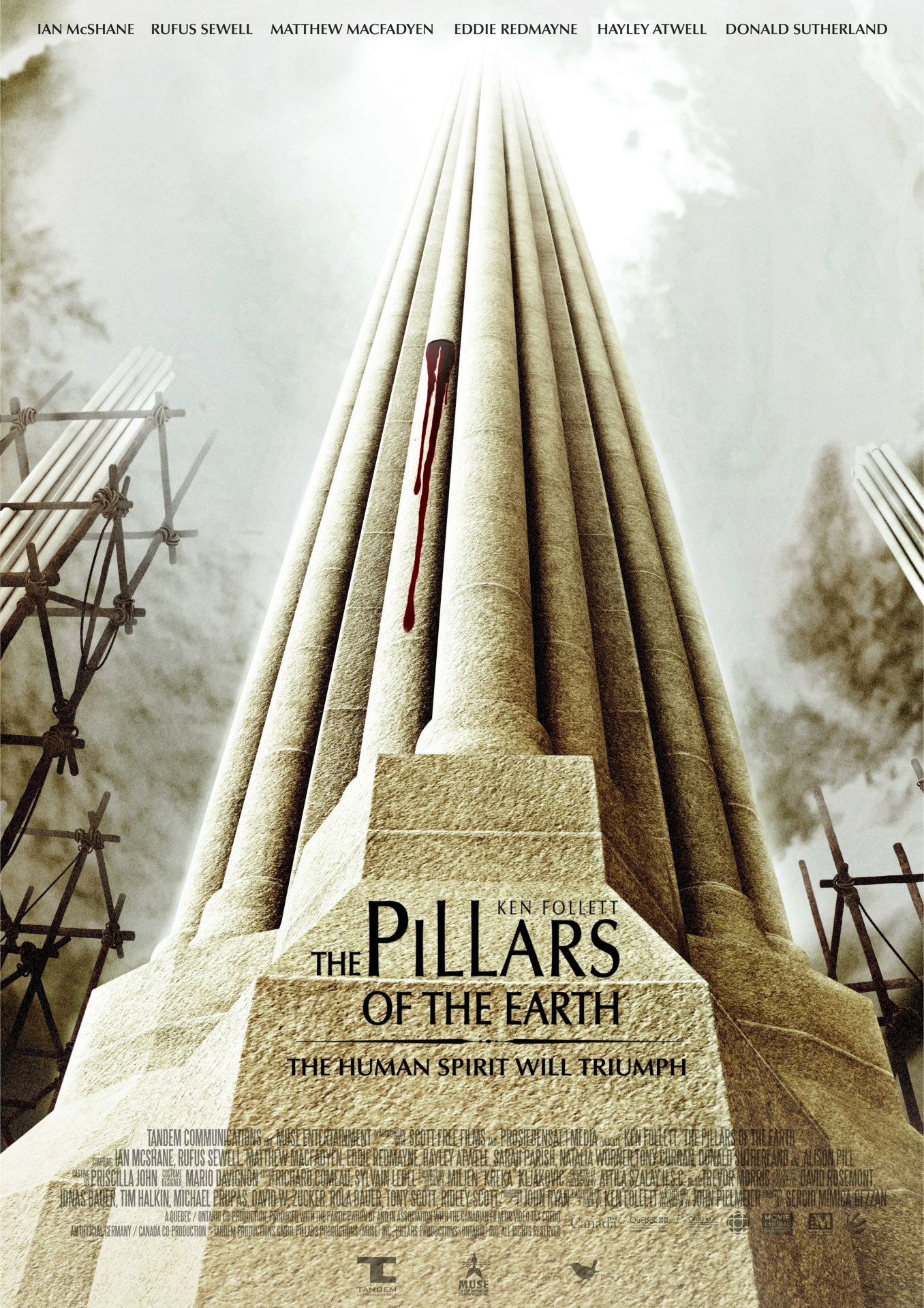
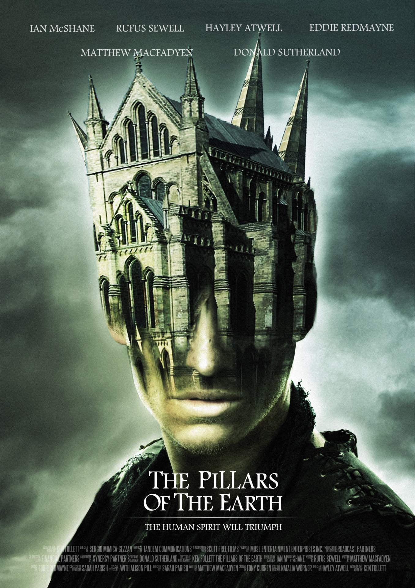
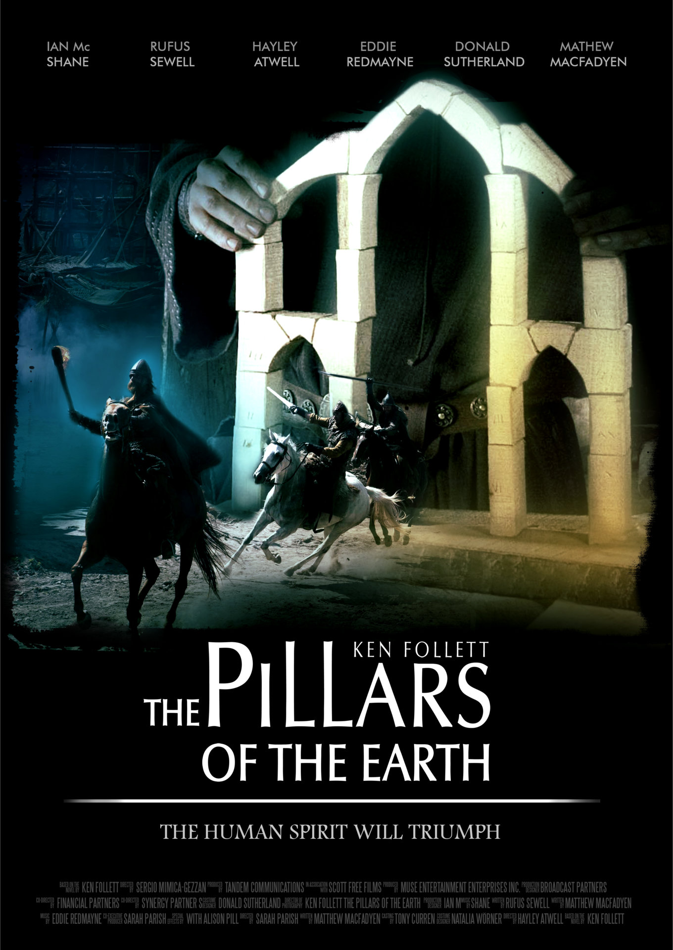
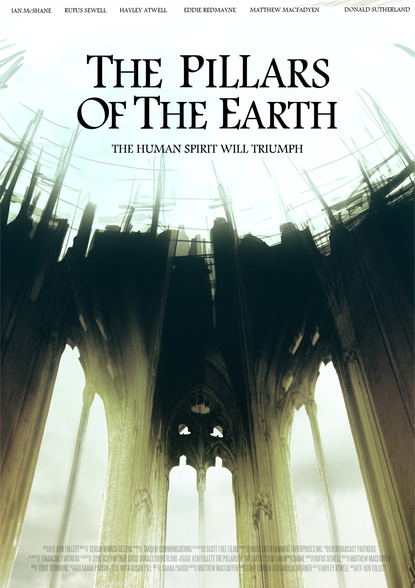
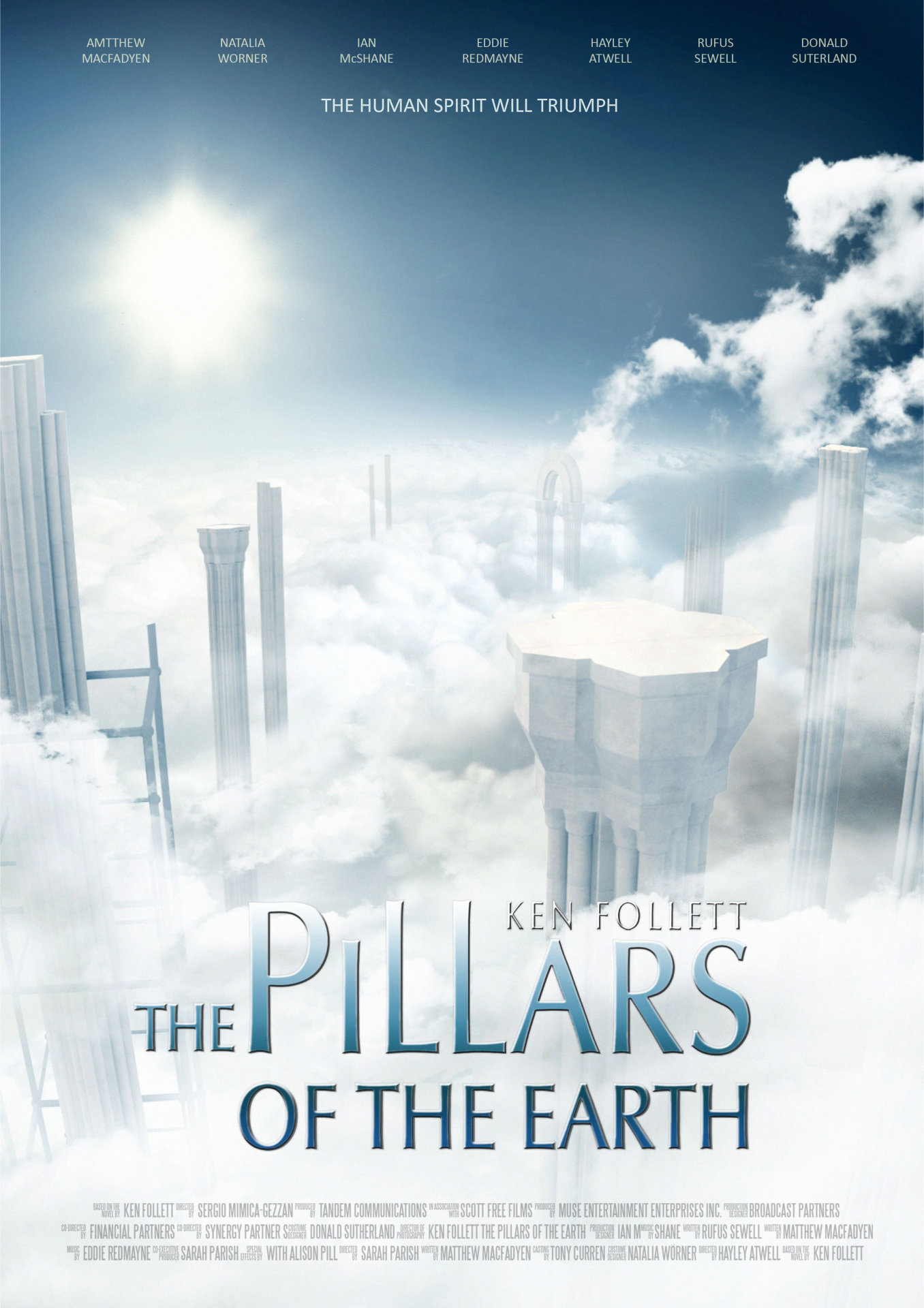
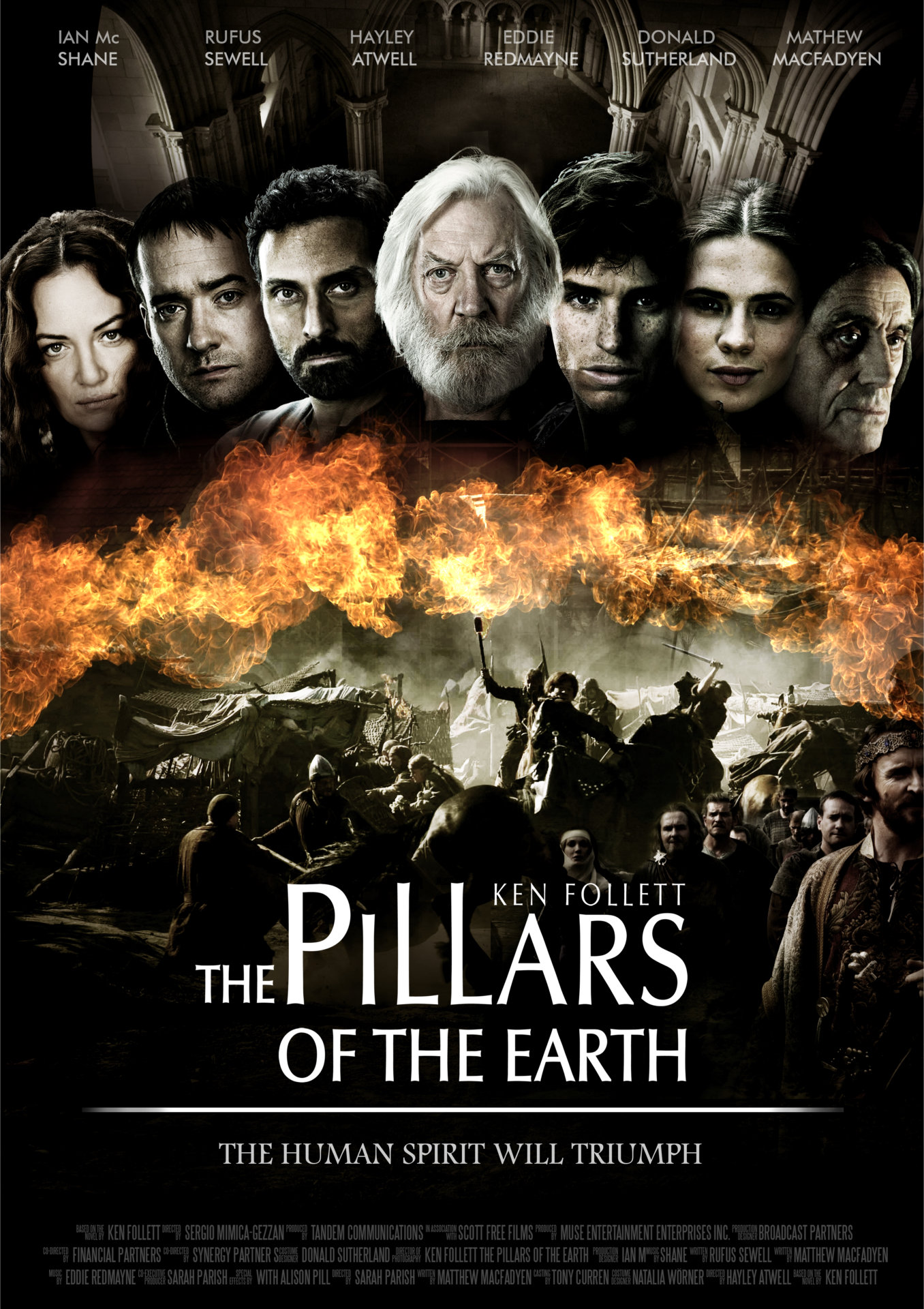
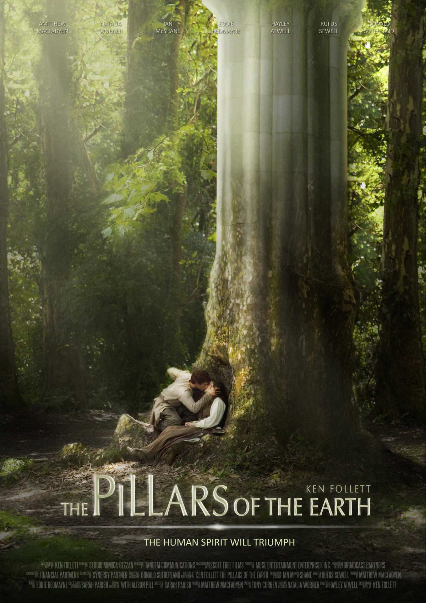
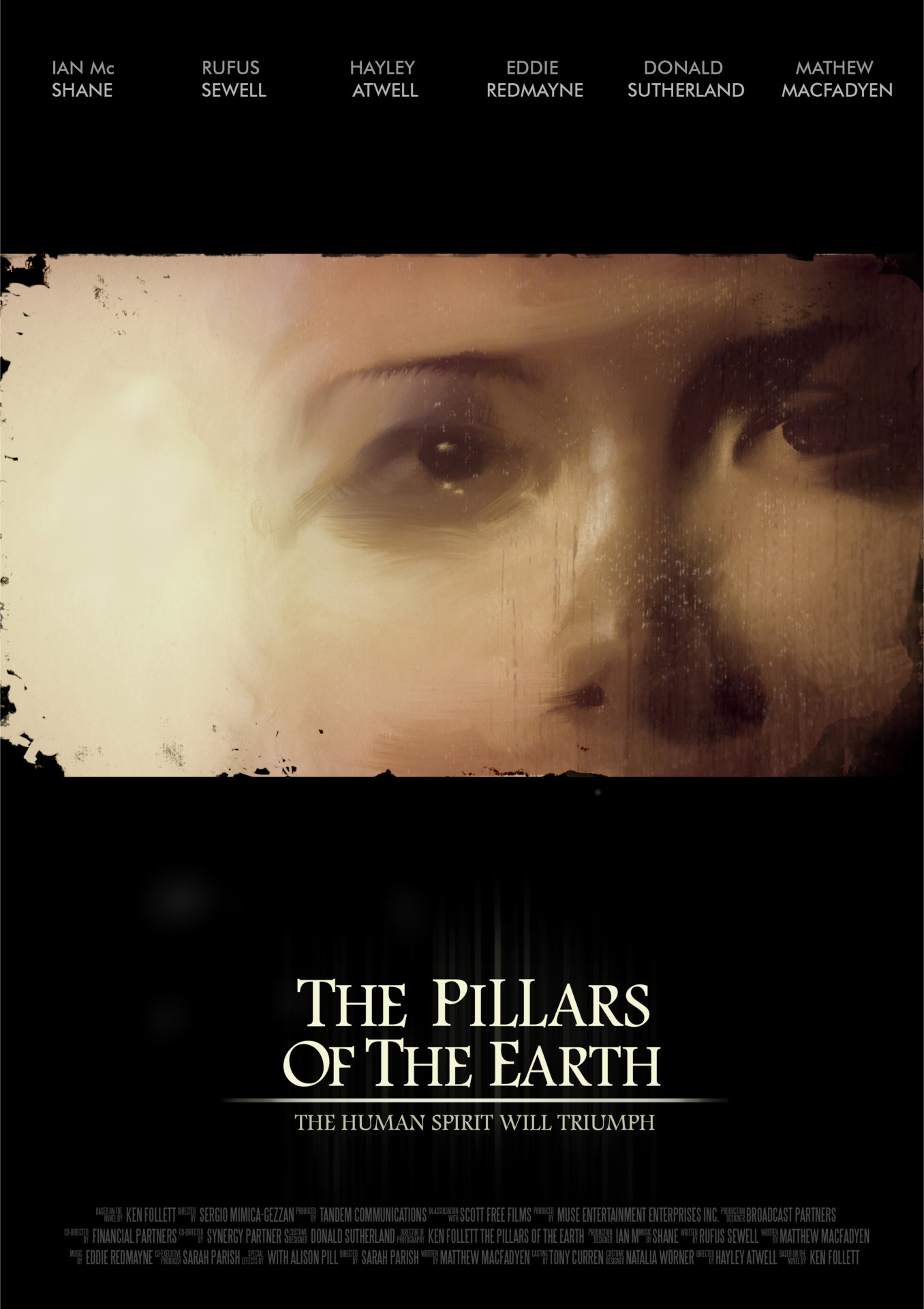
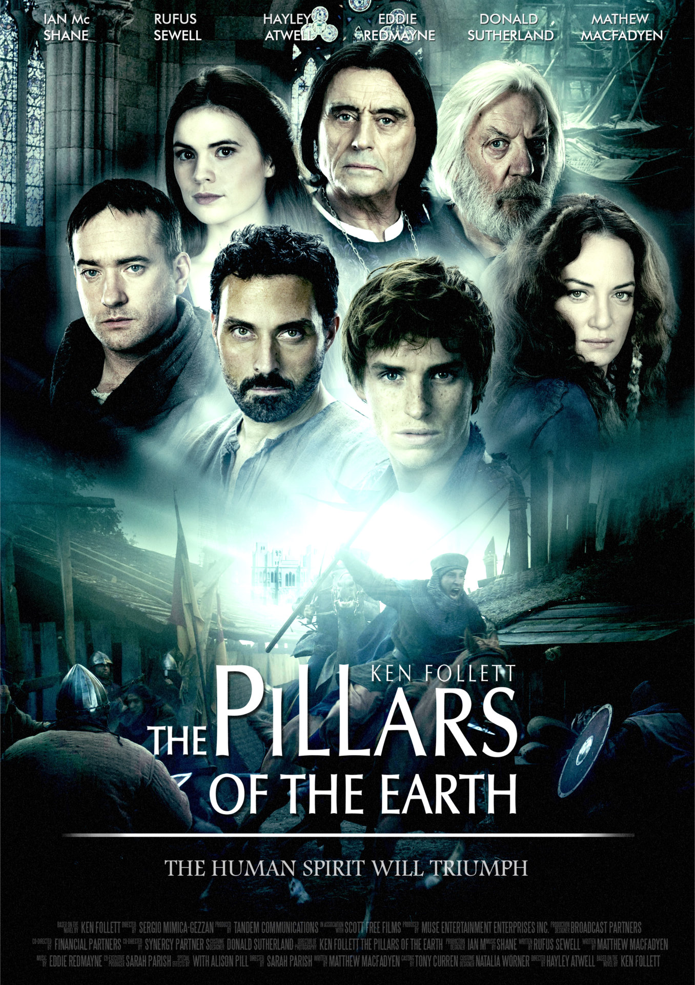
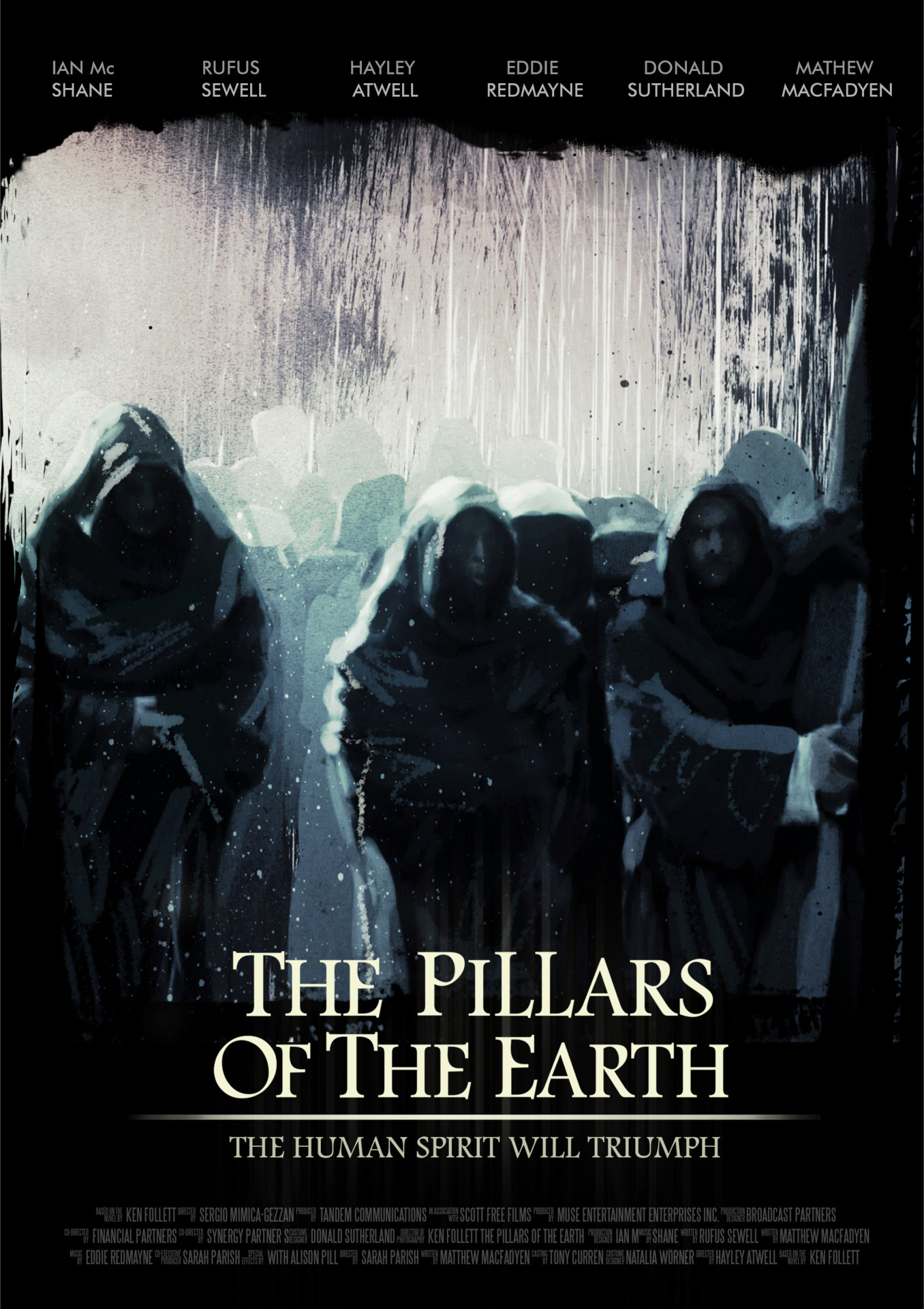
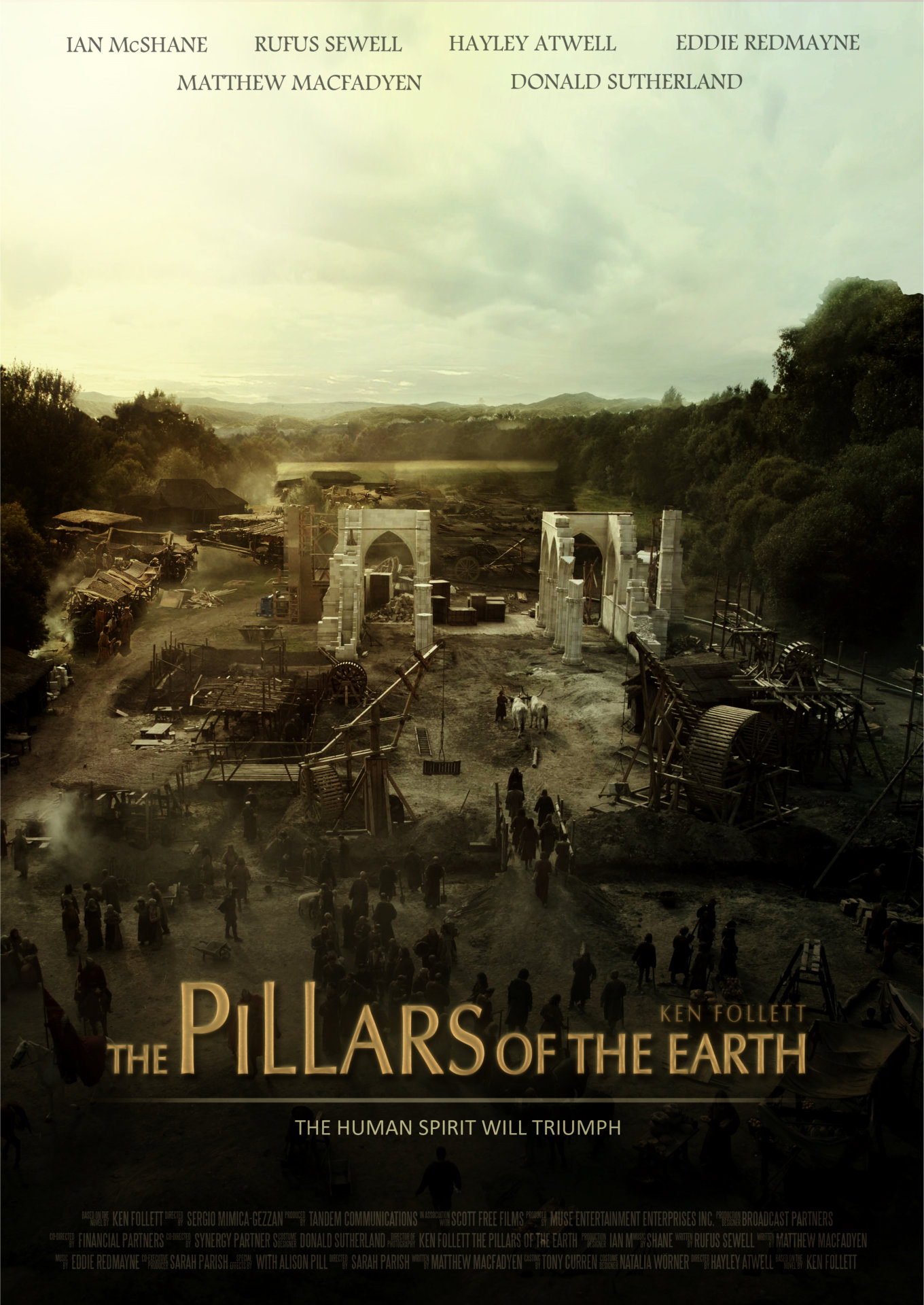
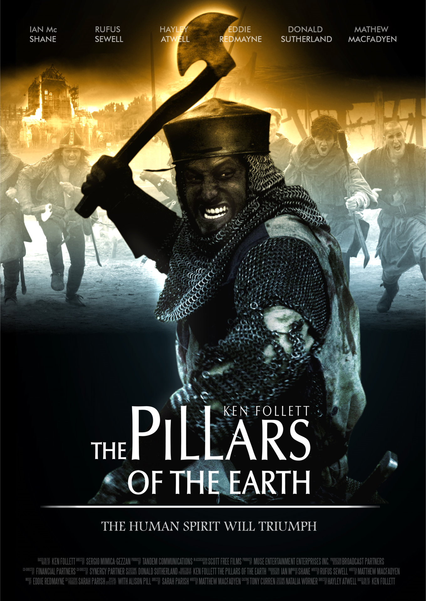
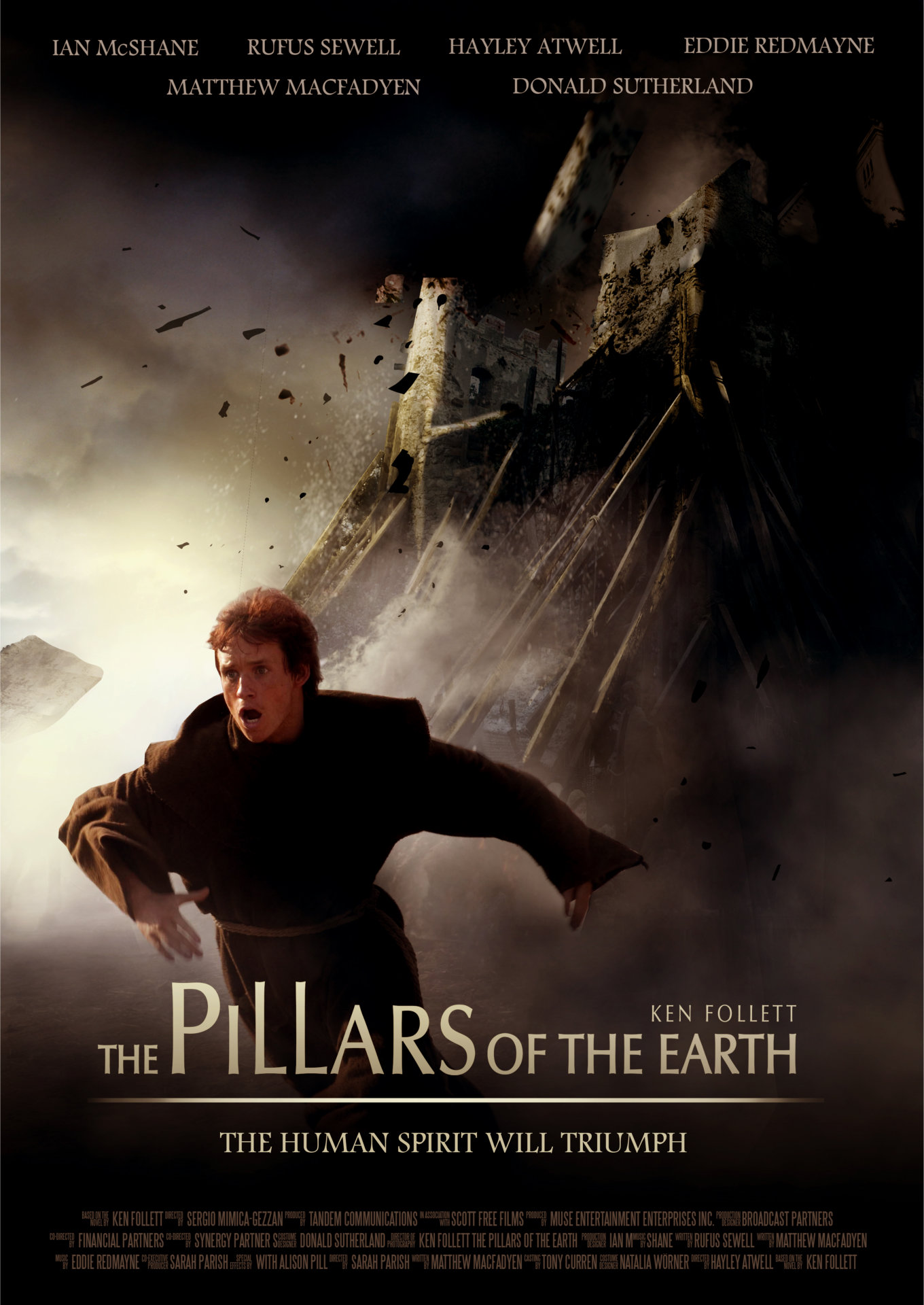
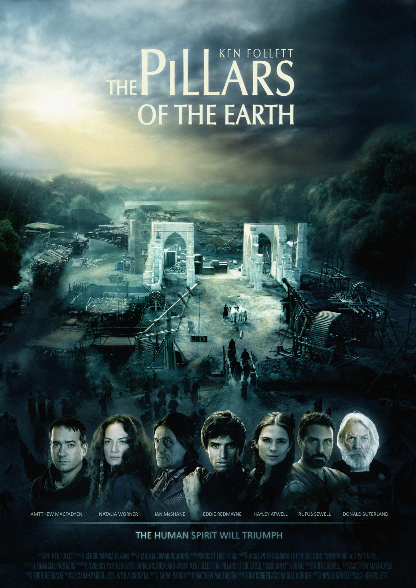
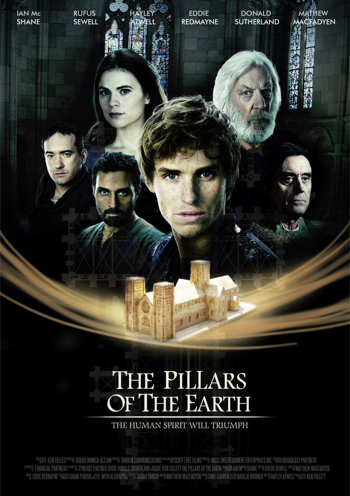
We were asked to prepare several versions of posters. I regret that none of them was selected.
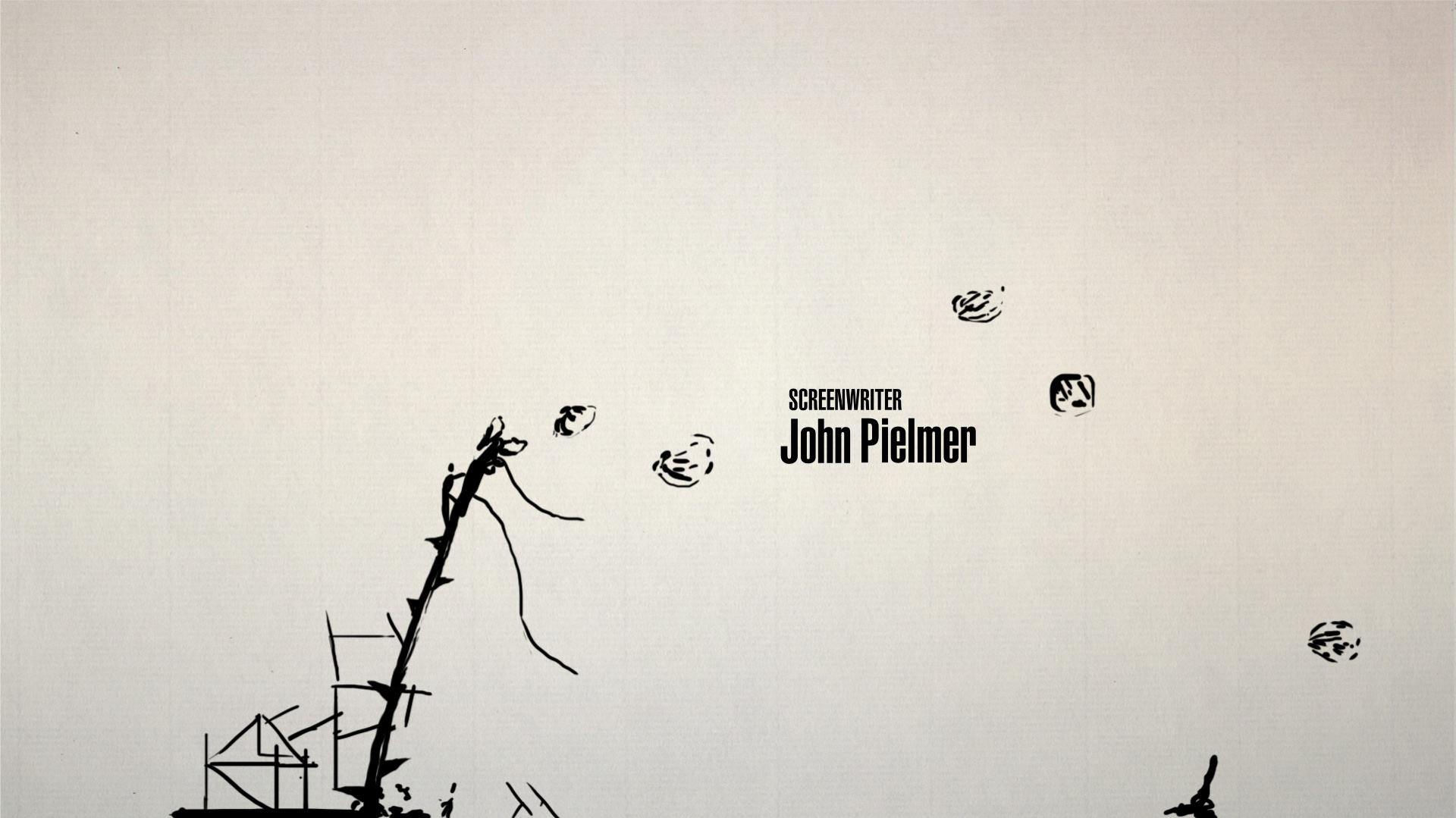
‘The Head of a Boy’ (00:25 sec., from the final animatic) was initially supposed to be Eddie Redmayne’s head. However, we didn’t have any material with Eddie. We shot our own references, with Kuba playing the main role. But he really didn’t look like him. Personally, I’m happy that this scene was not included, as we had less work to do, but Kuba lamented not being included.
Our greatest challenge was keeping the style of the painted frames consistent. Even though we’re brothers, each of us has a different character and sensitivity while working. But the final effect is coherent and uniform.
Concept 8

Pillars of the Earth Concept, property of BrosFX studio / unauthorized reproduction, copying prohibited. All rights reserved
Concept 9

Pillars of the Earth Concept, property of BrosFX studio / unauthorized reproduction, copying prohibited. All rights reserved
How big was the production team and how long did the project take?
There were the four of us: Michał Socha, Kuba Socha, Bartek Socha, and Mateusz Krygier.
The whole production lasted five months. One month of pitching, three months for animatics, animation, and posters, and one month for painting the final frames and their composition. It was a long and difficult journey which taught us a lot.
Animation Test A
Which tools and software did you use to put it all together?
We used 3D app for animation of the basic elements. Corel Painter 11 was helpful in painting frames and we used Adobe After Effects for compositing the final piece.
Animation Test B
What are some of your personal favorite title sequences, whether classic or contemporary?
There are several title sequences that I highly appreciate, for instance The Girl with the Dragon Tattoo, Psycho, Game of Thrones, etc.
I really like the combination of sophisticated typography with well-fitting music. I think that a good title sequence should have a simple graphic message that captures the character of the movie.
What’s next for you? Would you like to do more title sequences?
I just finished working on one of the chapters of The Prophet, an animated feature film. It is going to be a very interesting film, coming out in 2014.
Working on a title sequence gives me a wide range of possibilities. This was our first title sequence where we could really display our skills. Hopefully, it won’t be the last!
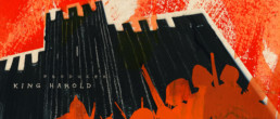
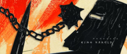
Early stage Posters concepts
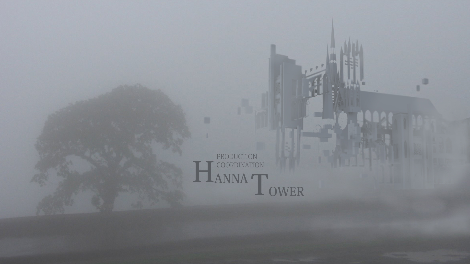
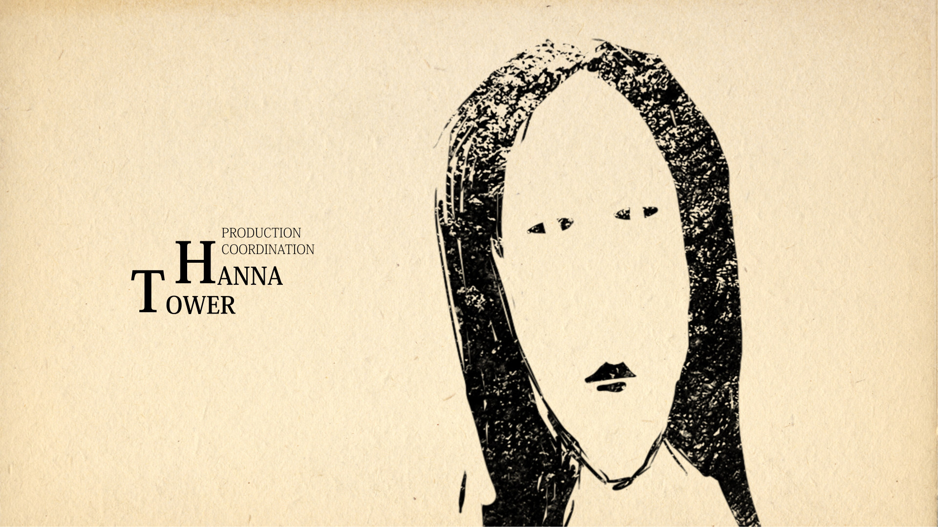
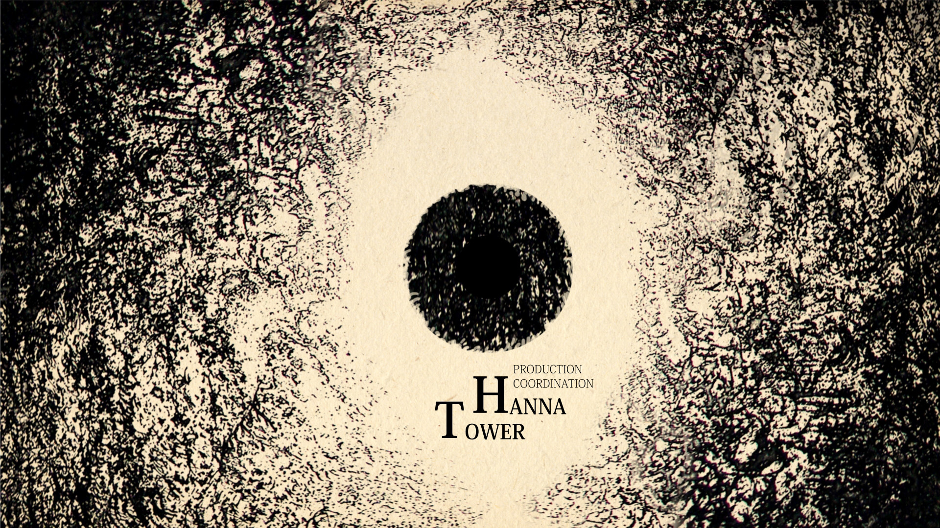
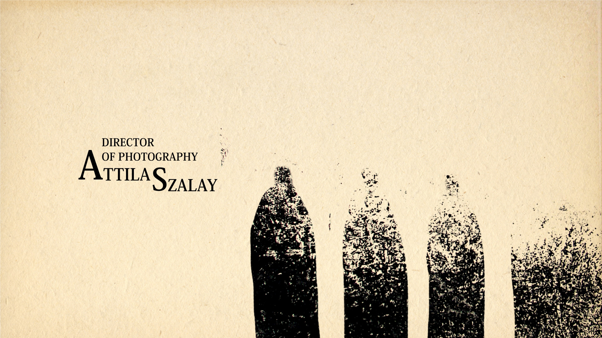
CREDITS
CLIENT: STARZ,
AGENCY: BrosFX
PRODUCTION HOUSE: Scott Free Production, Tandem Communications, Muse Entertainment
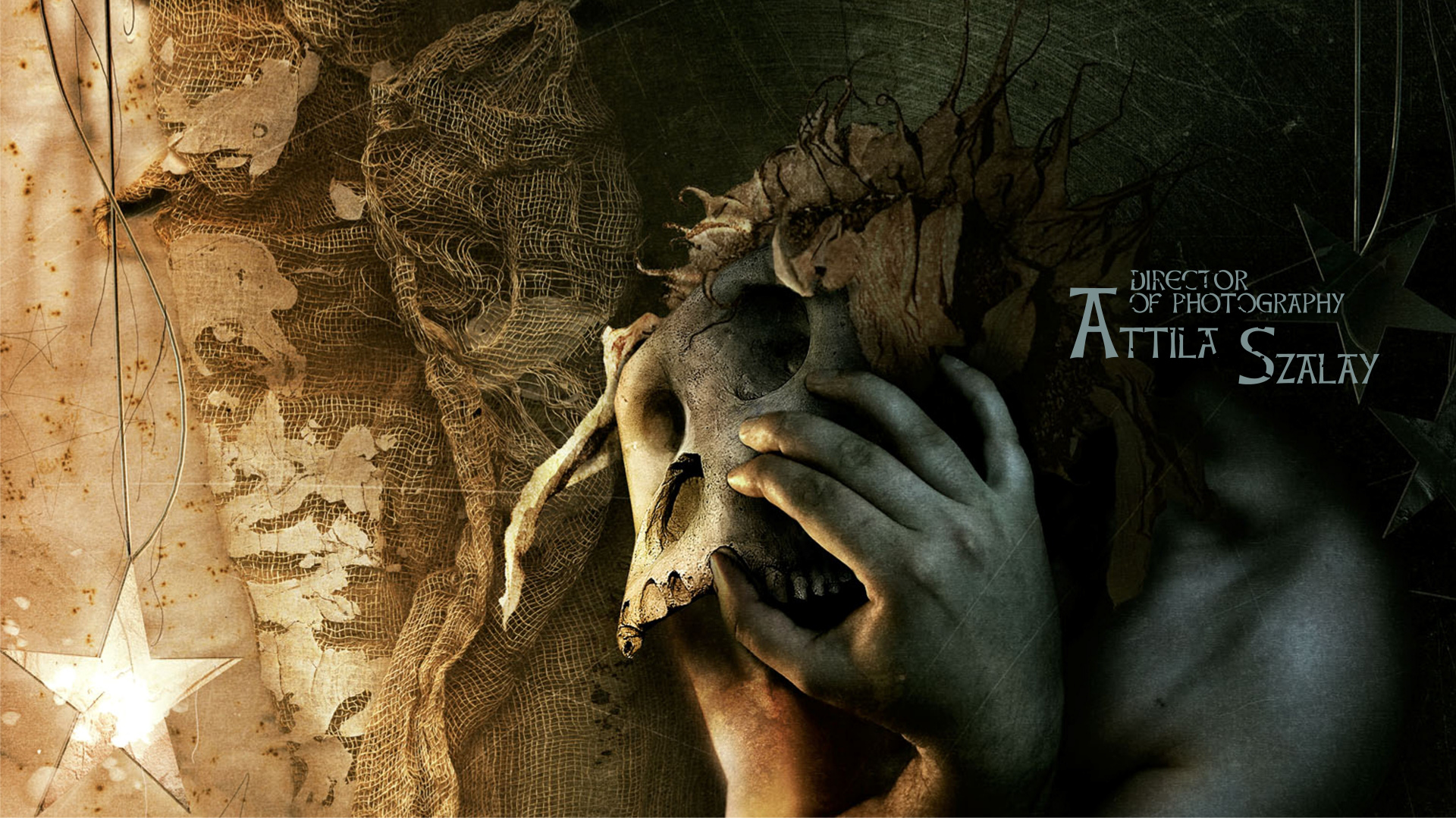
DIRECTED BY: Michal Socha BrosFX
ANIMATION DIRECTOR: Michał Socha
EXECUTIVE CREATION DIRECTOR: Michal Socha, Kuba Socha, Bartek Socha
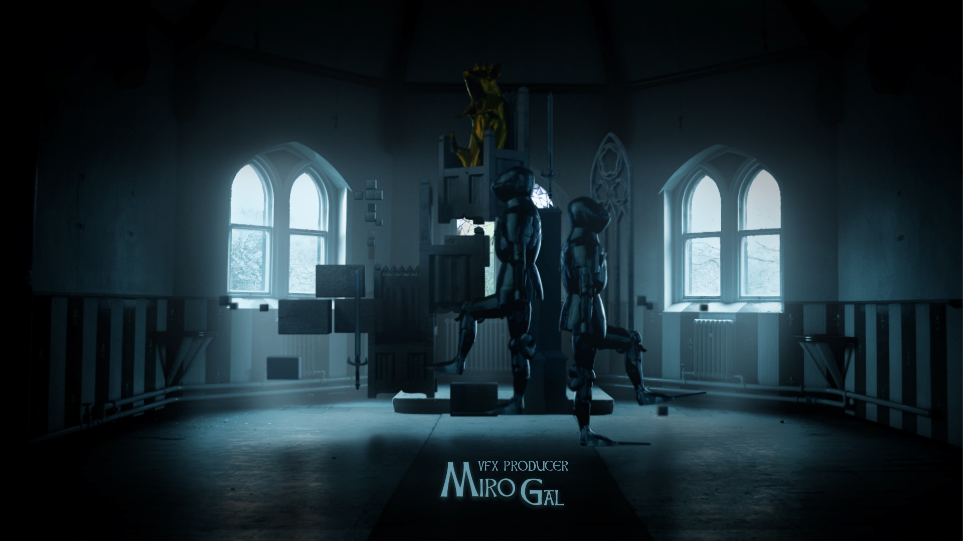
EXECUTIVE PRODUCER: ACME Filmworks, Ron DIamond
HEAD OF PRODUCTION: Kuba Socha BrosFX
STRORYBOARDS: Michal Socha
DESIGN: Michal Socha, Kuba Socha, Bartek Socha, Mateusz Krygier
EDIT: Michal Socha, Kuba Socha, Bartek Socha
ANIMATION: Michal Socha, Kuba Socha, Bartek Socha, Mateusz Krygier
COMPOSITION: Michal Socha, Kuba Socha, Bartek Socha,
COLORIST: Michal Socha, Kuba Socha, Bartek Socha
POSTER DESIGNERS: Kuba Socha, Michal Socha